 Mantovan

Doraiza Expeditions
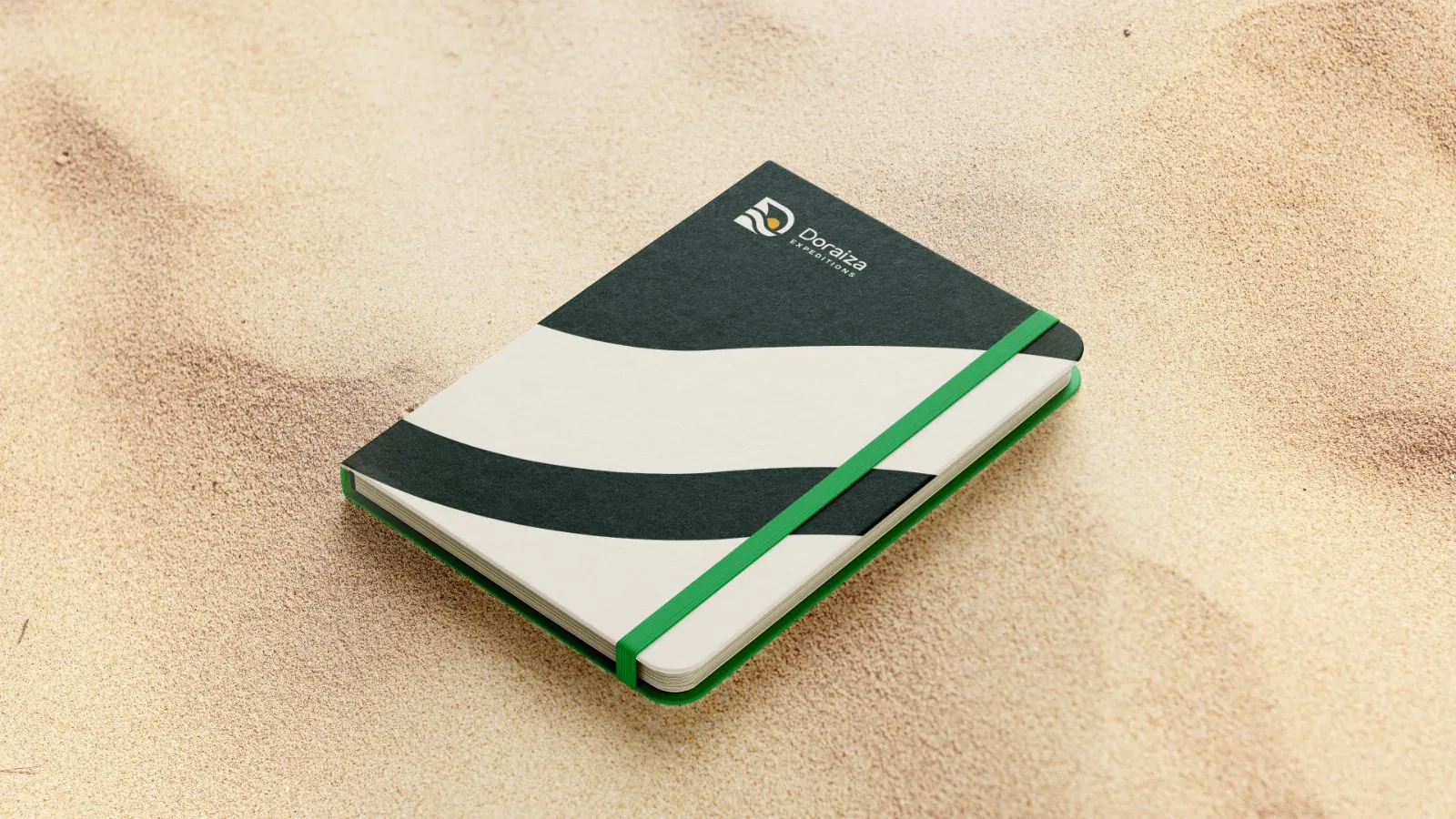
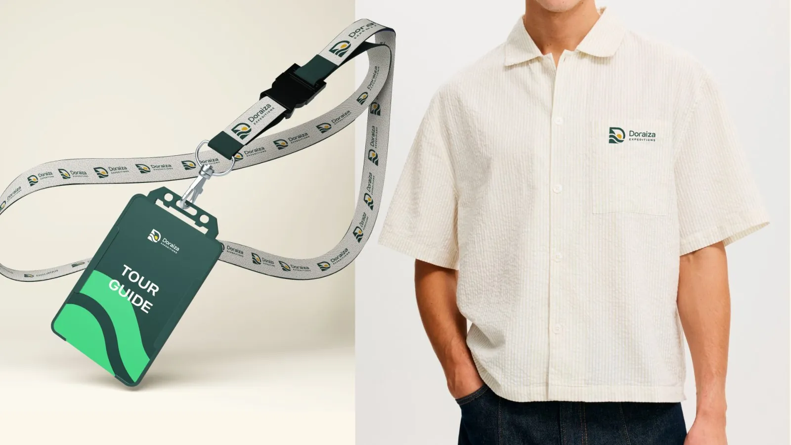
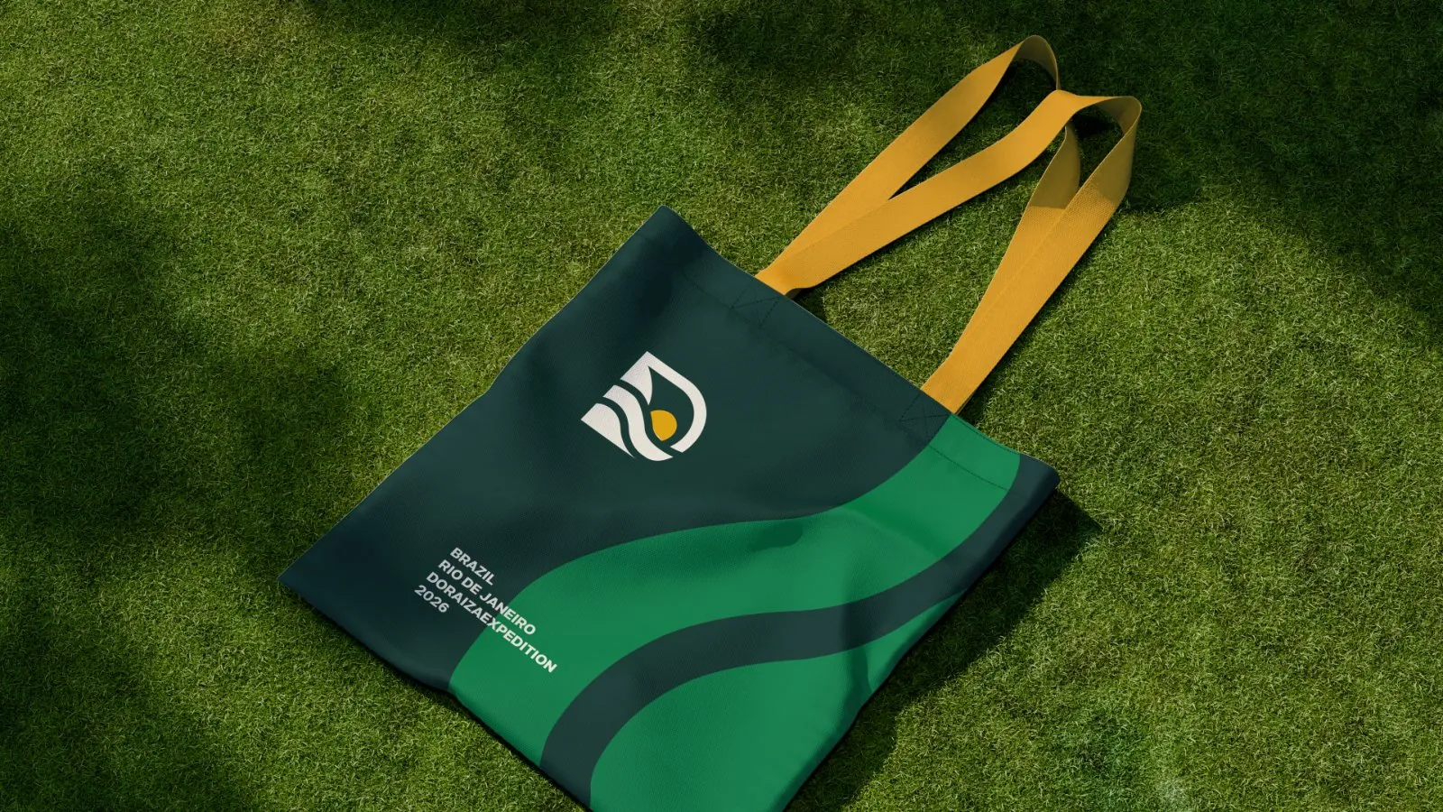
Doraiza Expeditions is the international brand of travel creator Izadora Moraes, built to bring foreign travelers to Brazil. I designed the symbol, wordmark and campaign, and applied them from the website to the travel kit.
I bring brands into everyday life, from Deusa’s packaging, designed at Bangboo, to Doraiza’s travel materials. I’m a Senior Brand & Visual Designer with 9+ years in agencies and in-house teams. I design identities and campaigns, and make motion graphics and AI video.
A food brand with over 80 years of history · Project at Bangboo
Eight identities from my independent practice. I developed each one from the initial brief to its applications.
Doraiza Expeditions is the international brand of travel creator Izadora Moraes, built to bring foreign travelers to Brazil. I designed the symbol, wordmark and campaign, and applied them from the website to the travel kit.
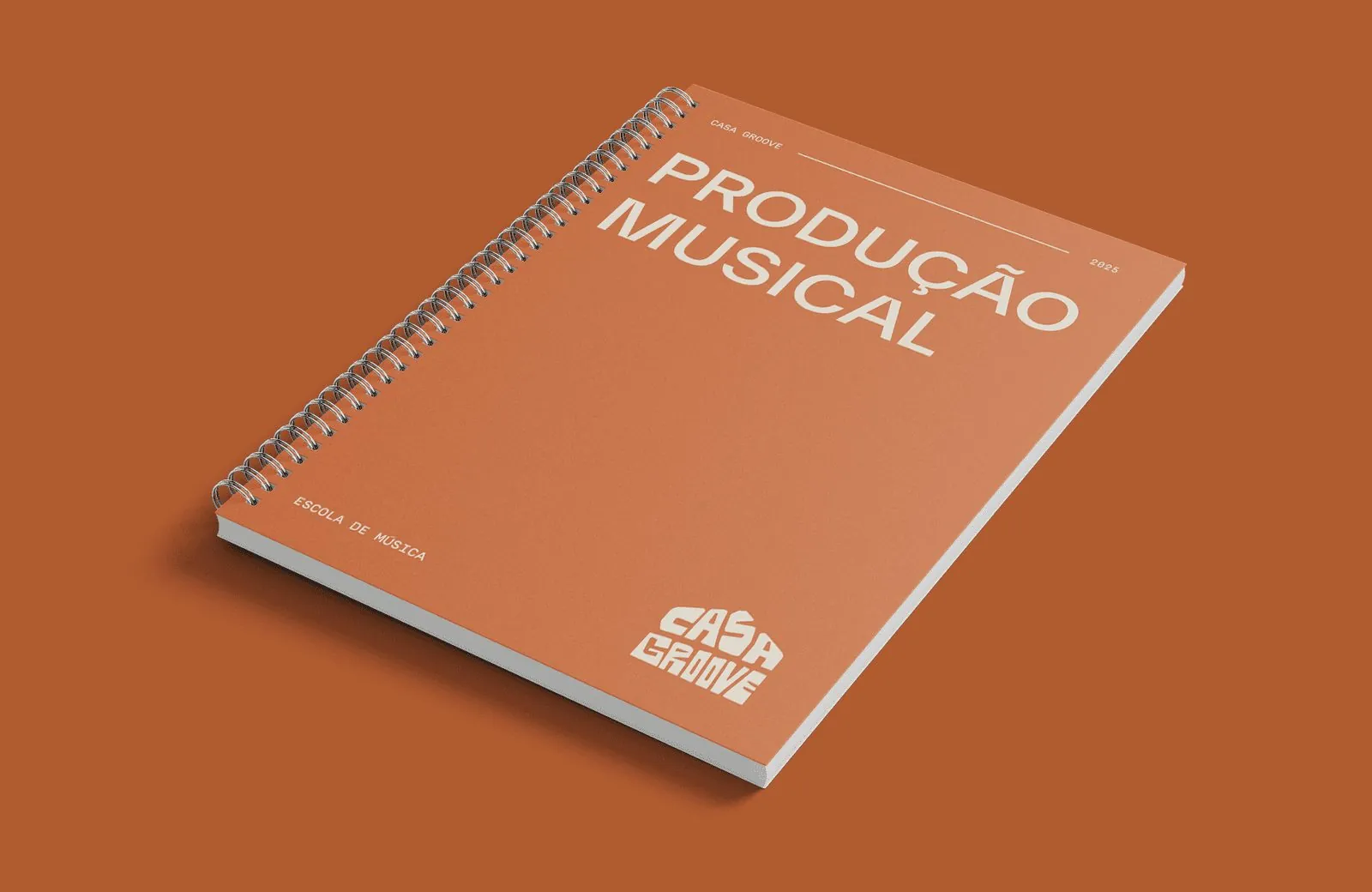
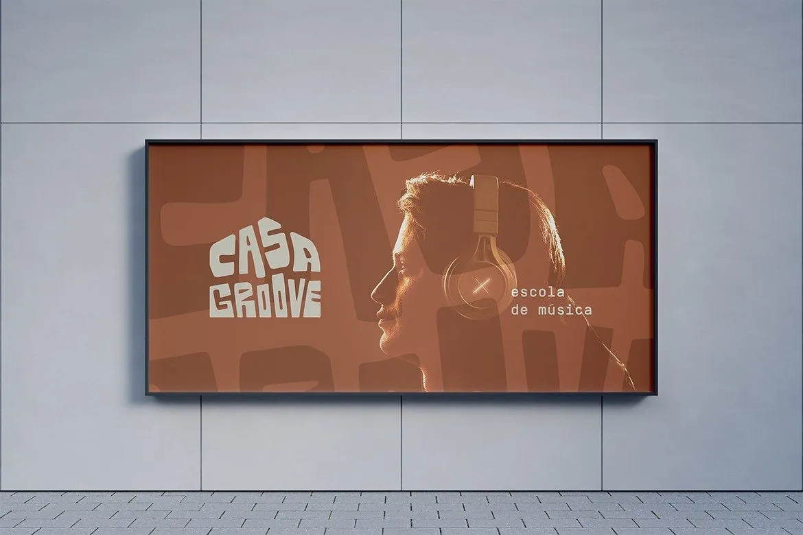
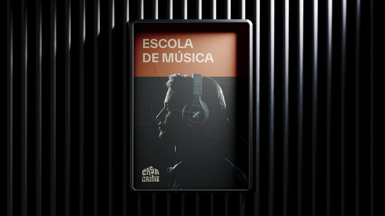
Casa Groove is a music school in Maringá. The name gave me the idea for the logo: a house drawn into the letters. I also developed the symbol and typography system.

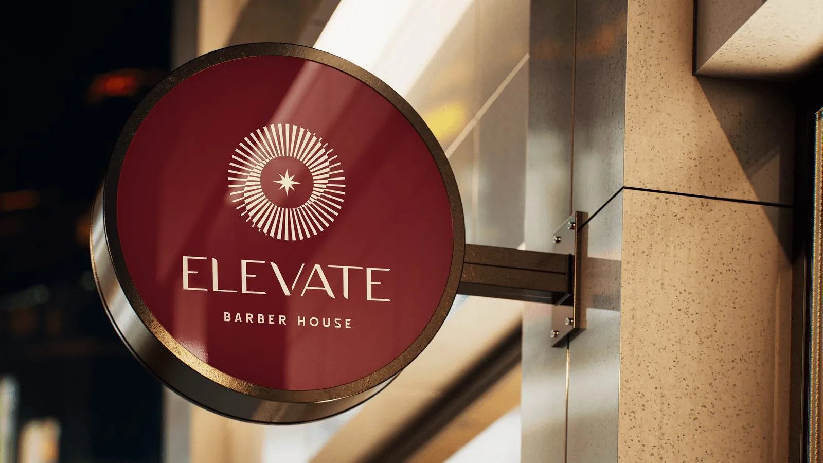
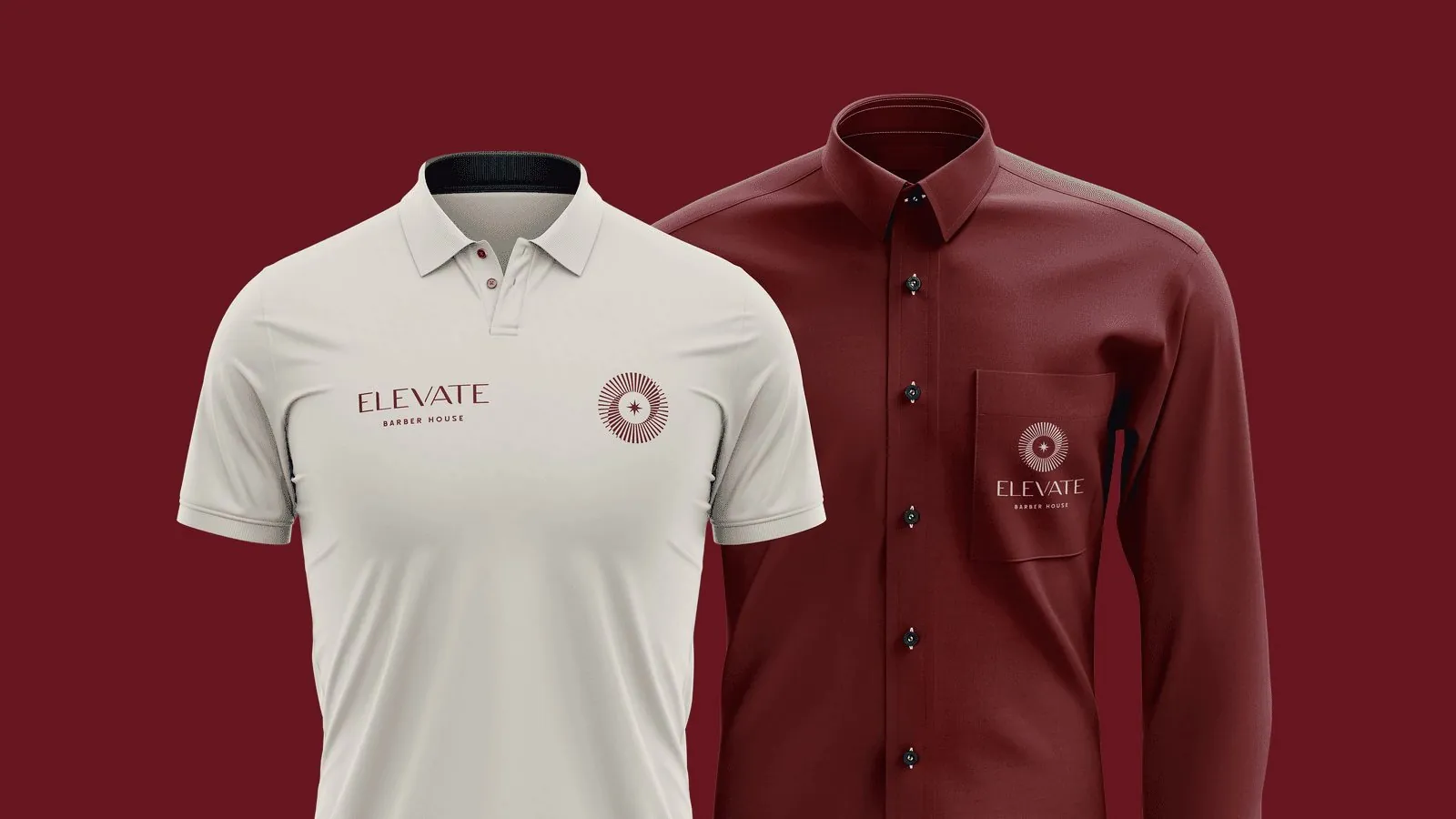
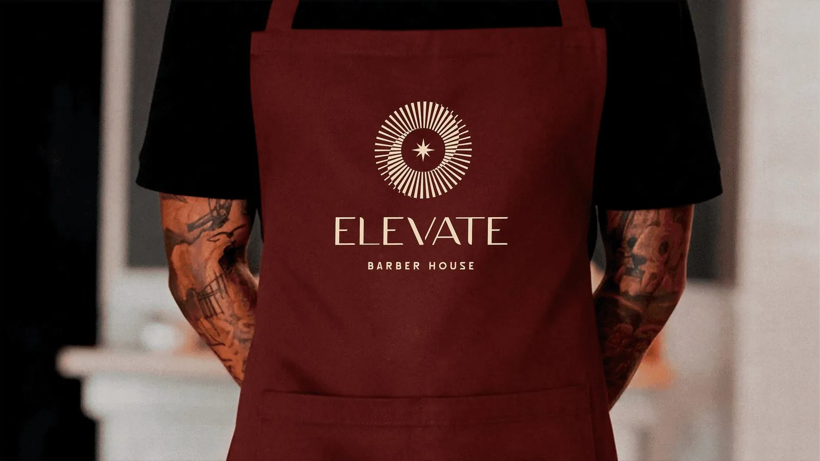
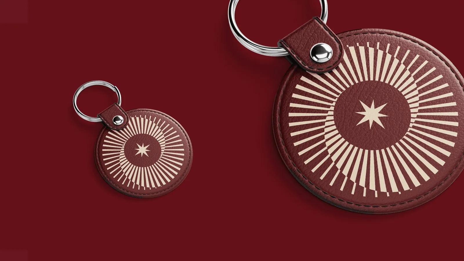
Deep wine red, heavy lettering and plenty of space around it. That’s the identity I designed for Elevate Barber House, including its logo and seal.
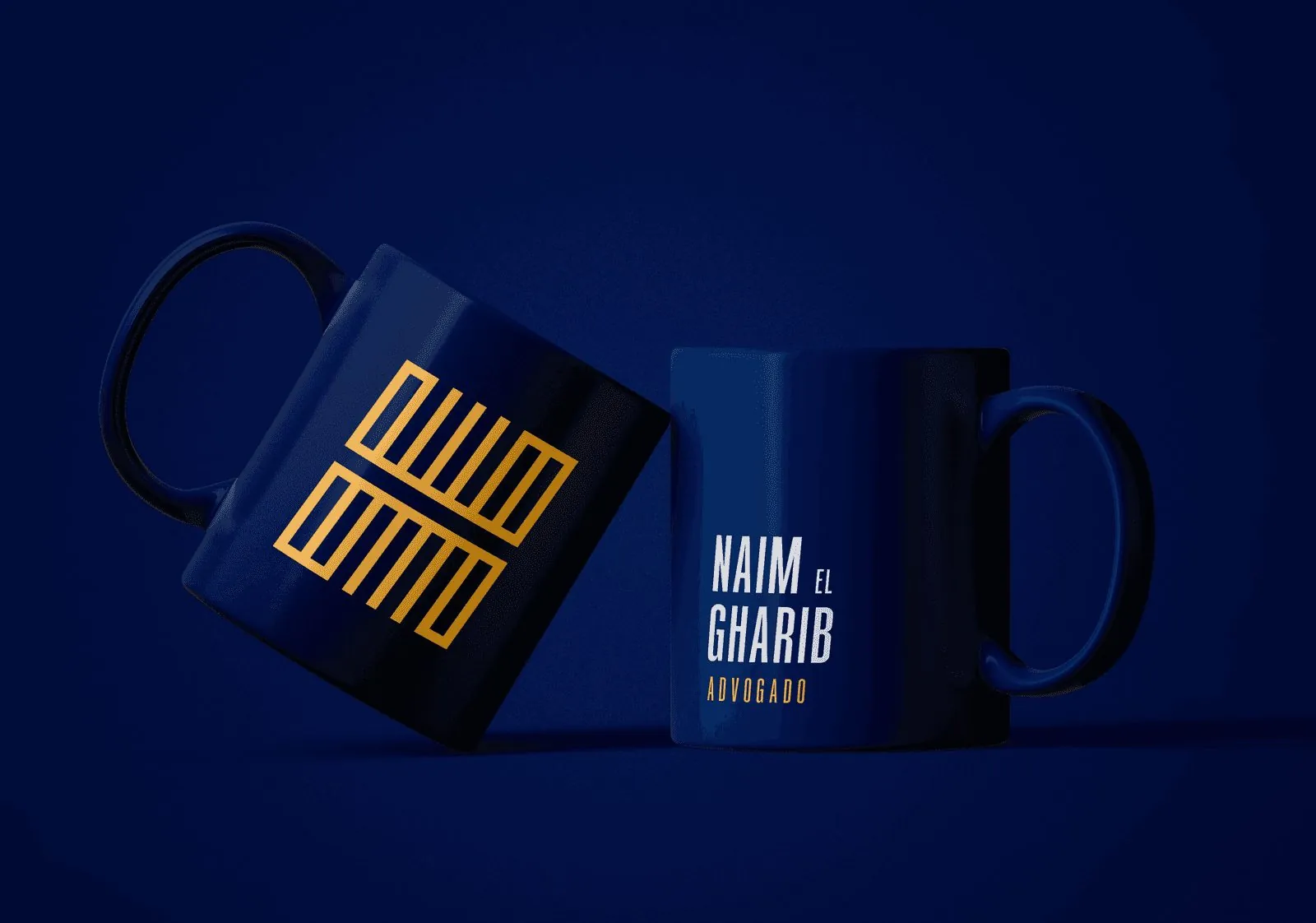
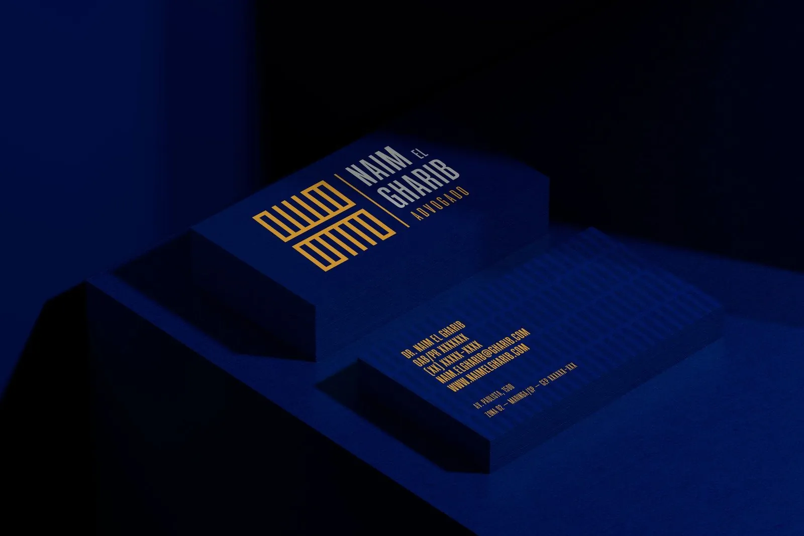
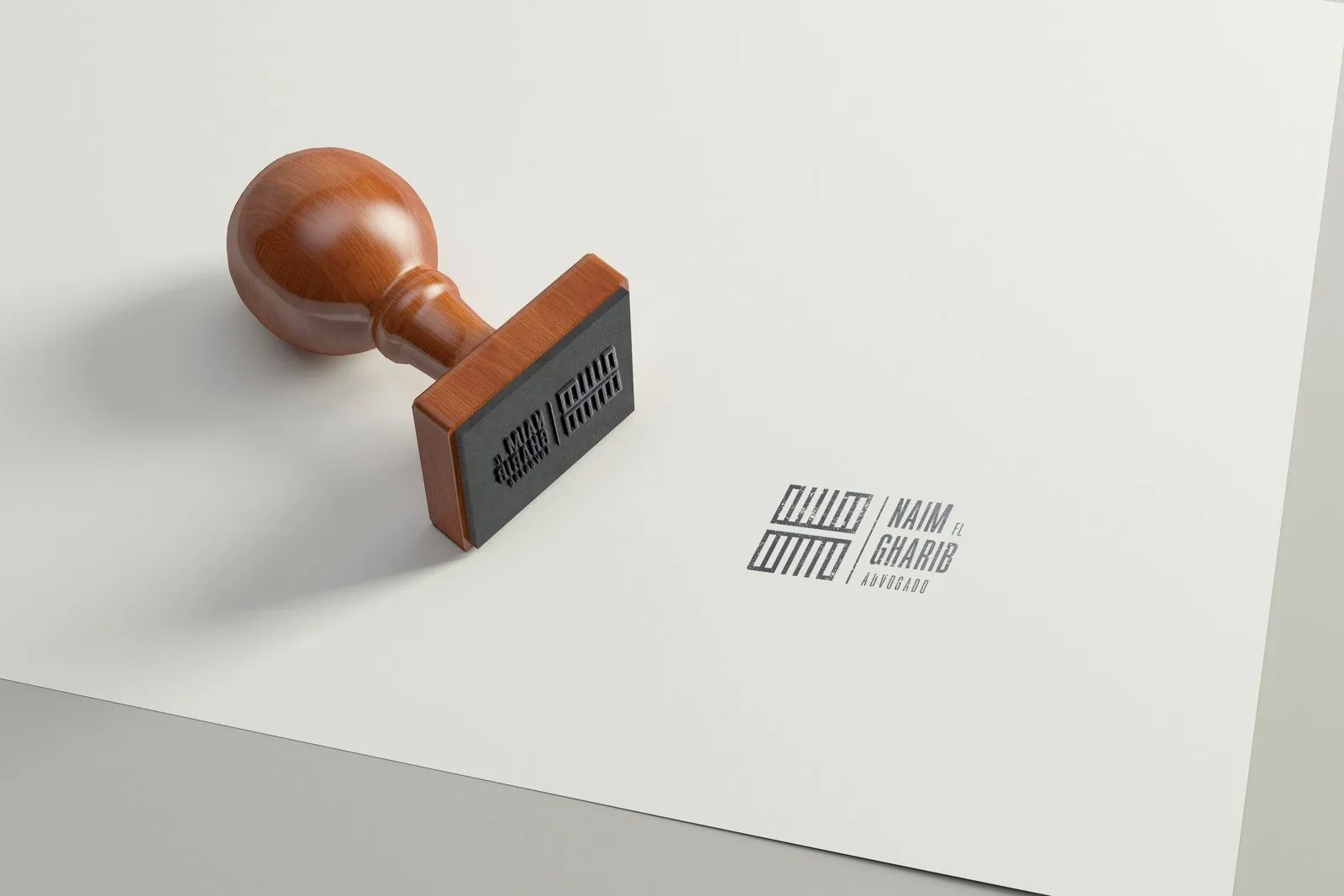
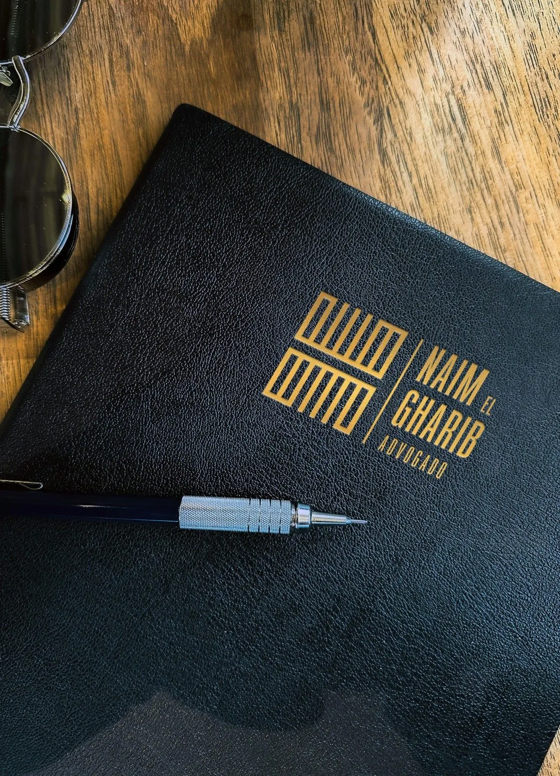
Naim El Gharib needed an identity for his law practice. I made his name the main element, with lettering based on classical columns.

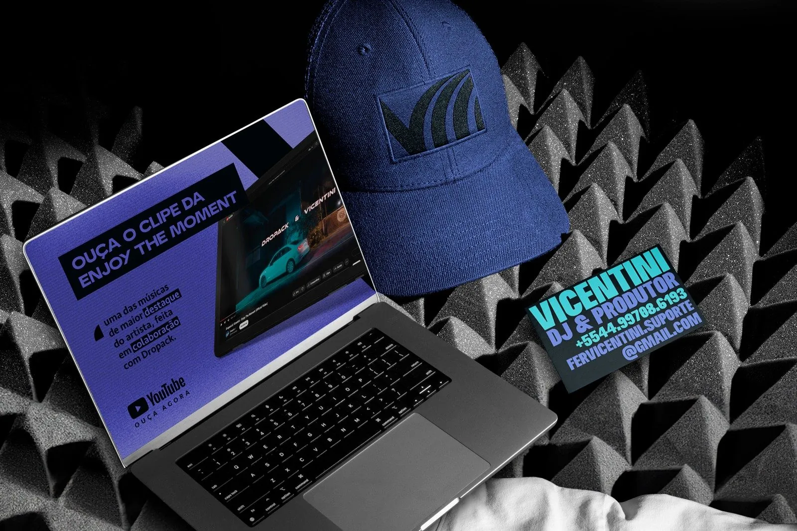
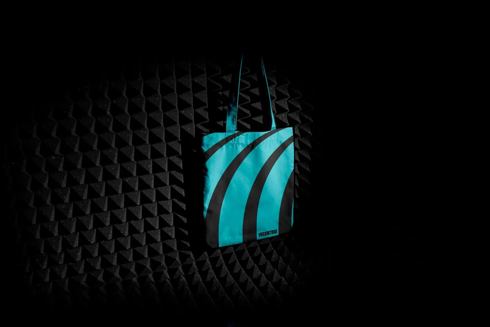
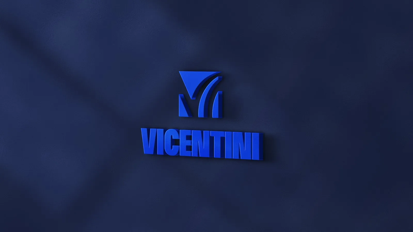
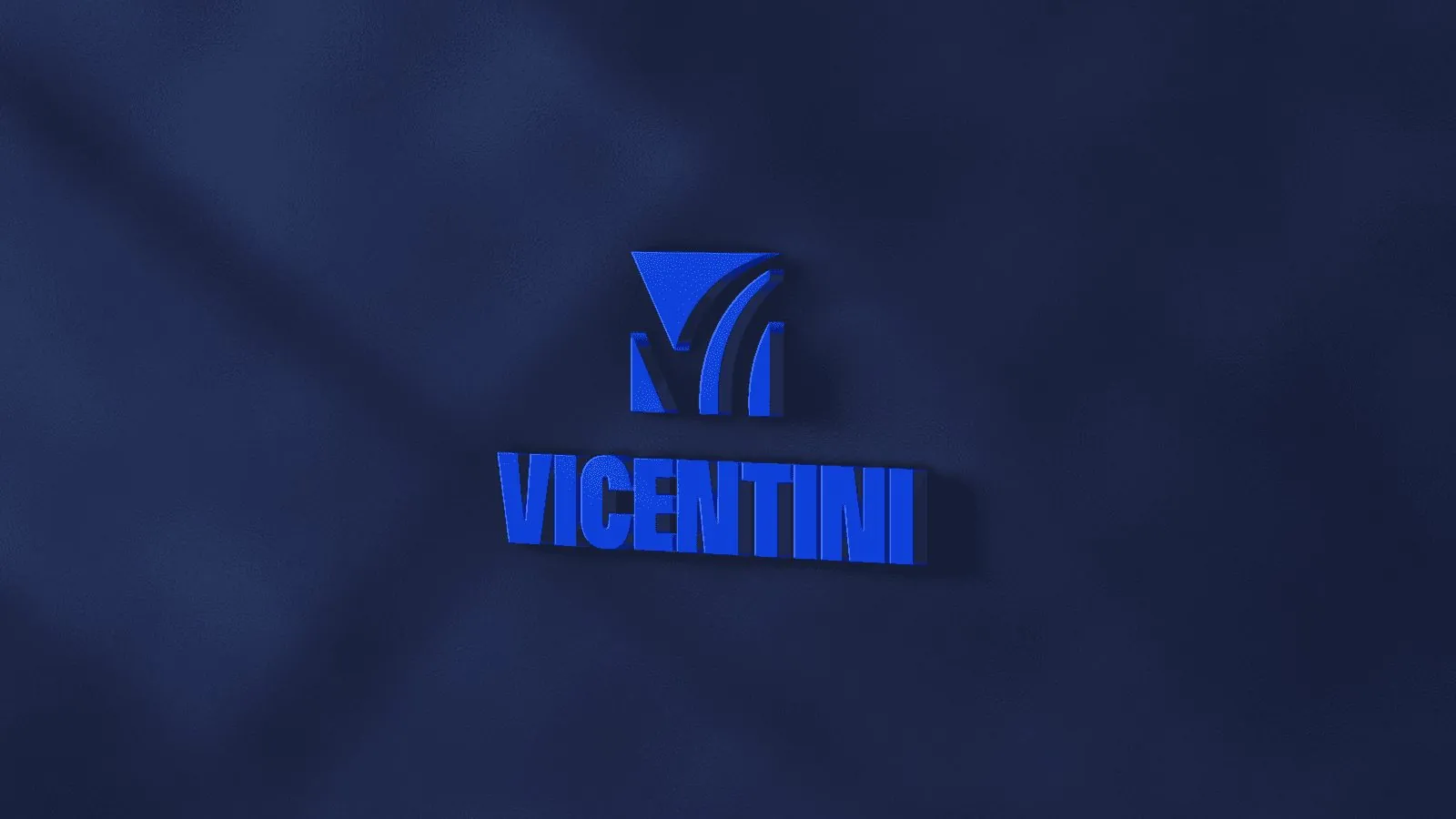
For music producer and DJ Vicentini, I designed a monogram with sharp cuts and curves, paired with heavy lettering.

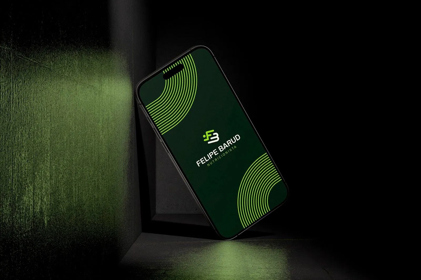
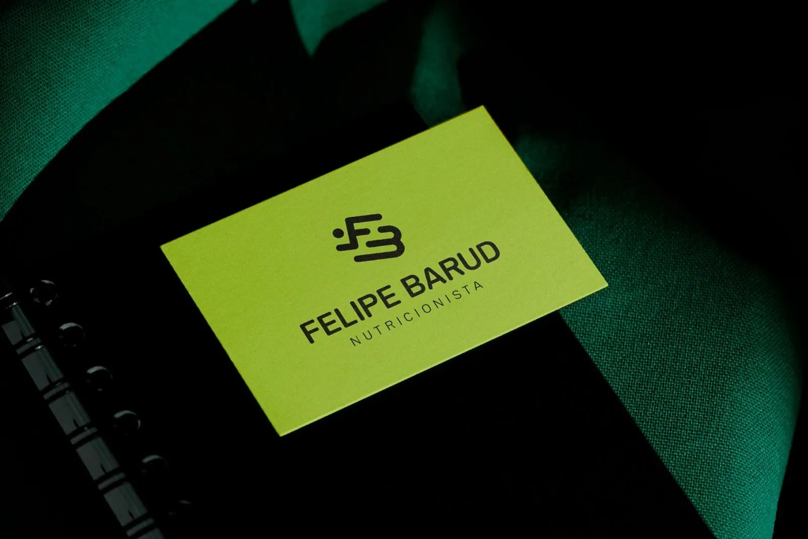
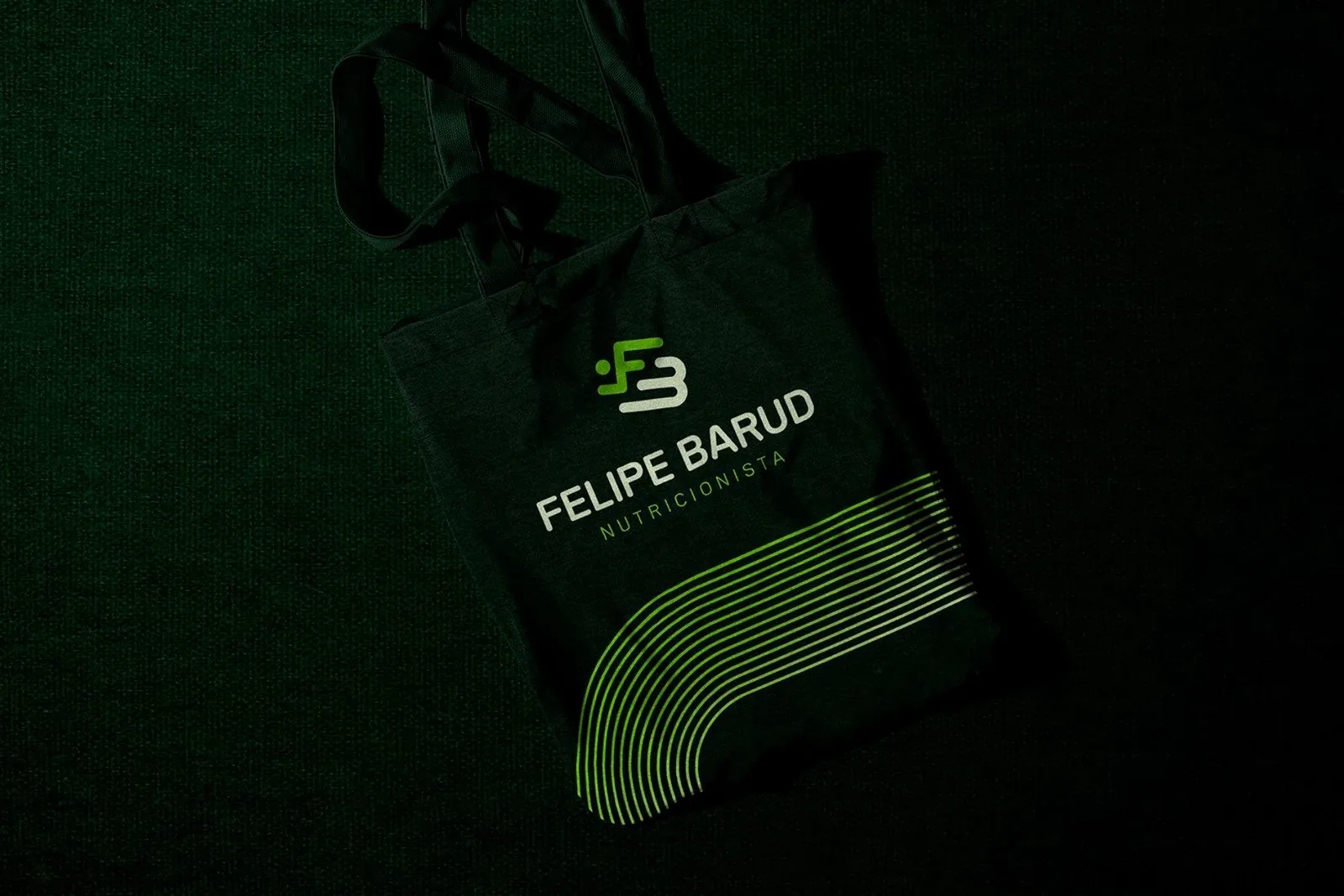
Felipe Barud works with endurance athletes. I kept his identity simple so the nutrition information would remain the focus.

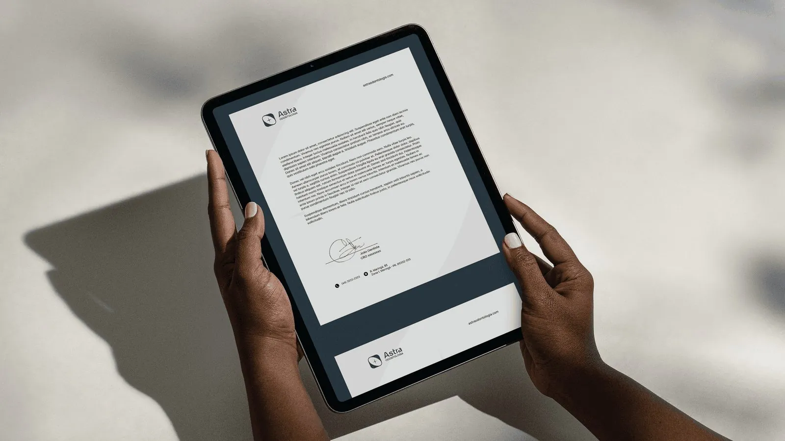
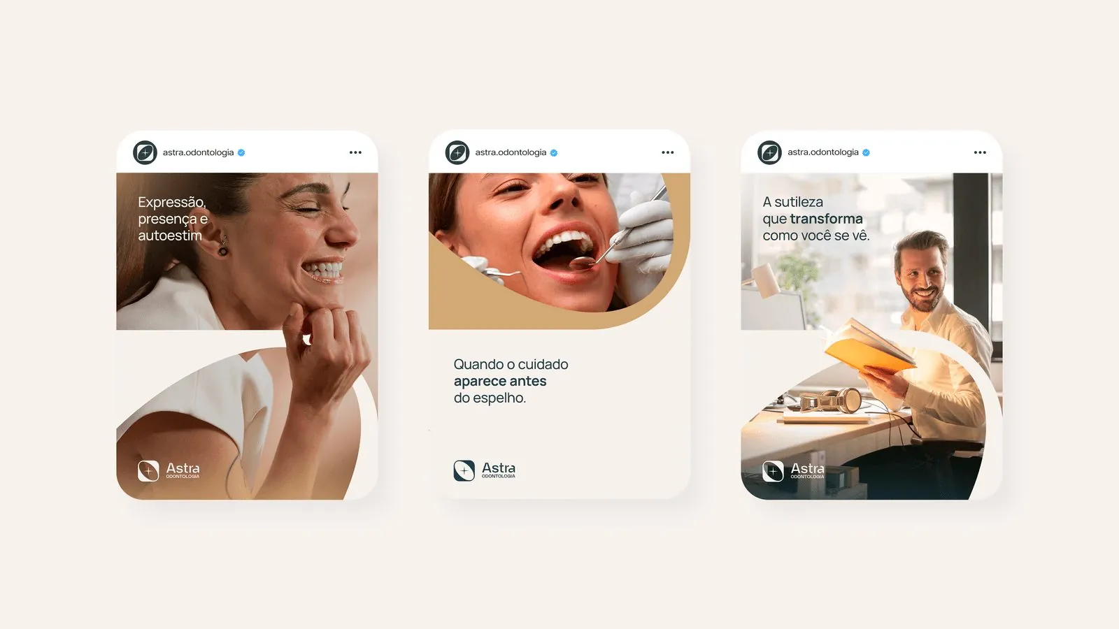
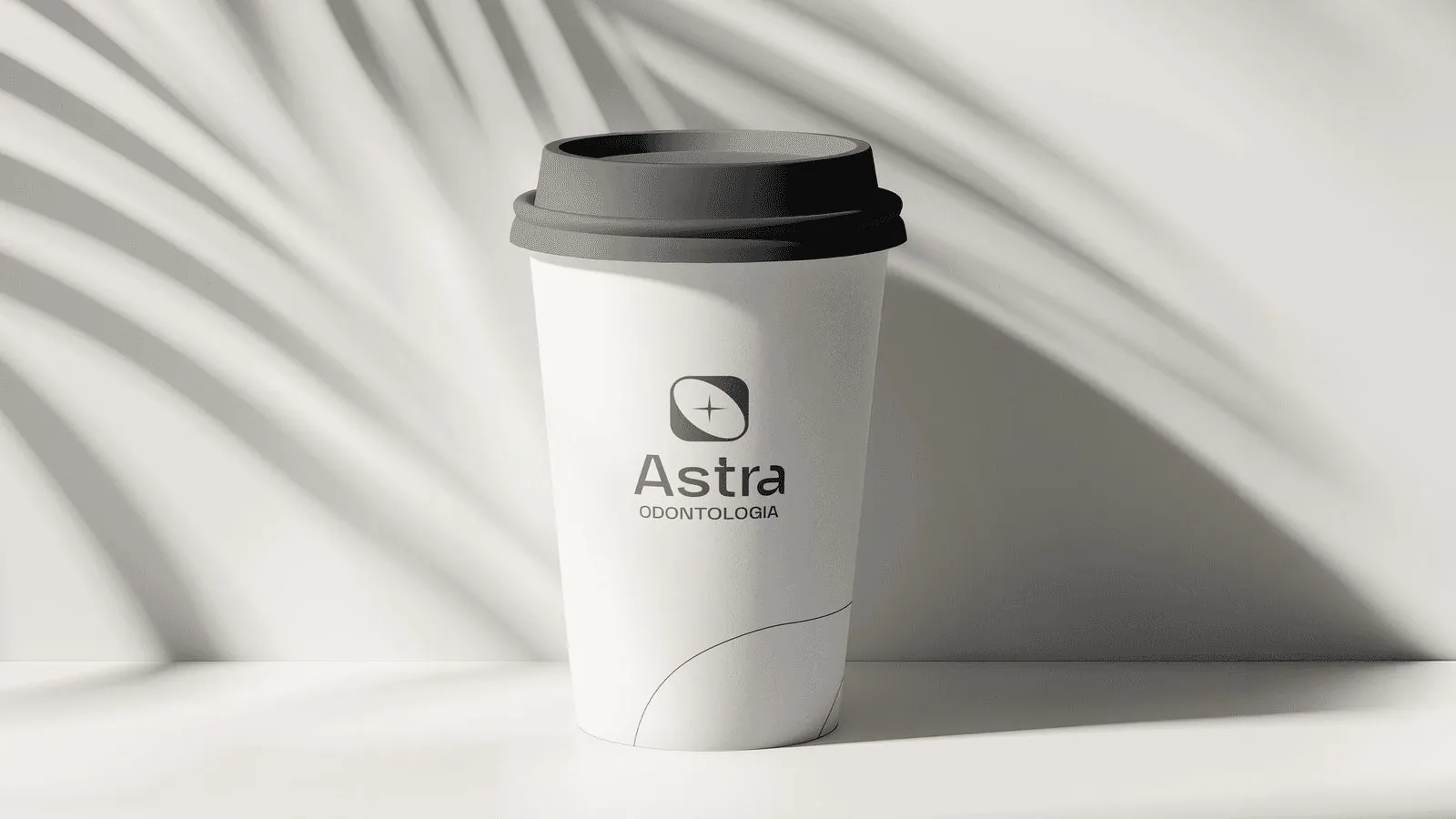
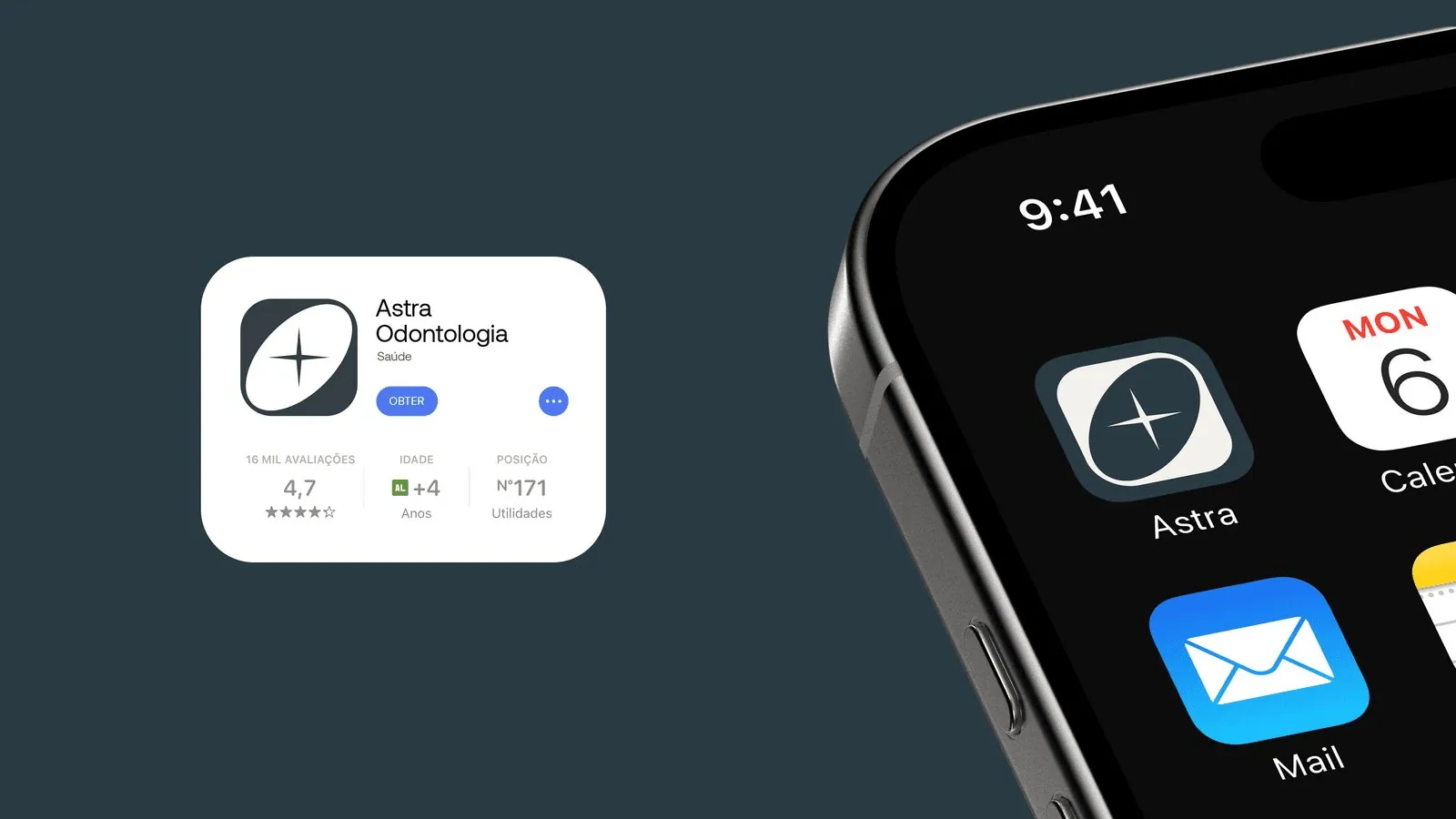
A star and a tooth in the same symbol. I designed Astra’s identity for an aesthetic dentistry practice.
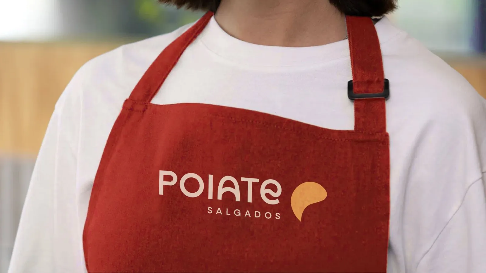
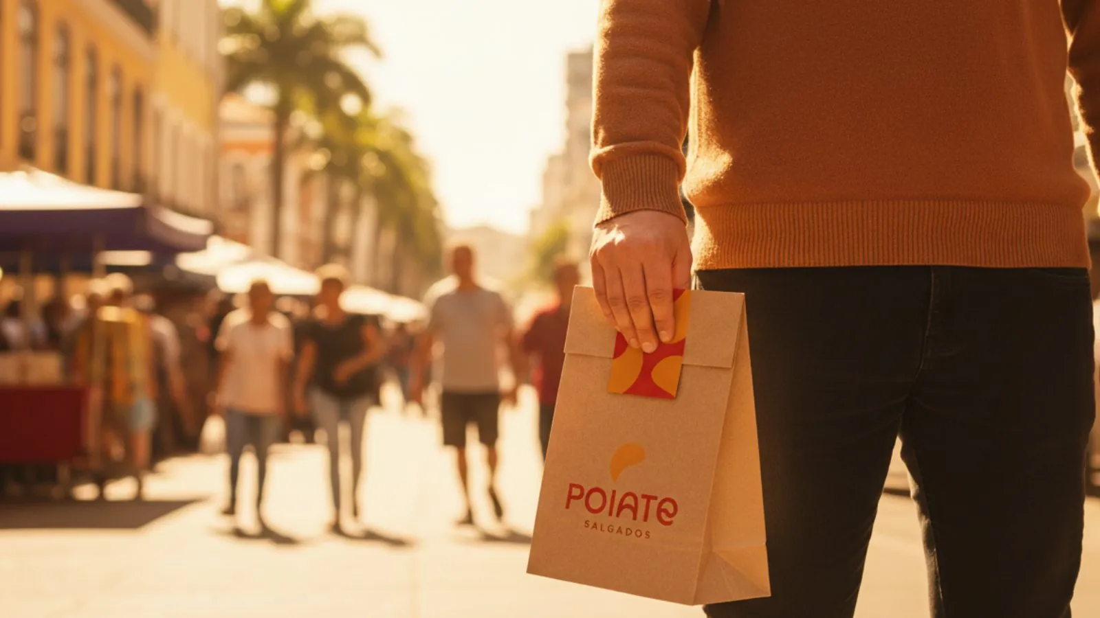
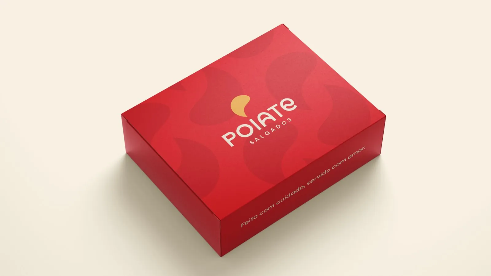
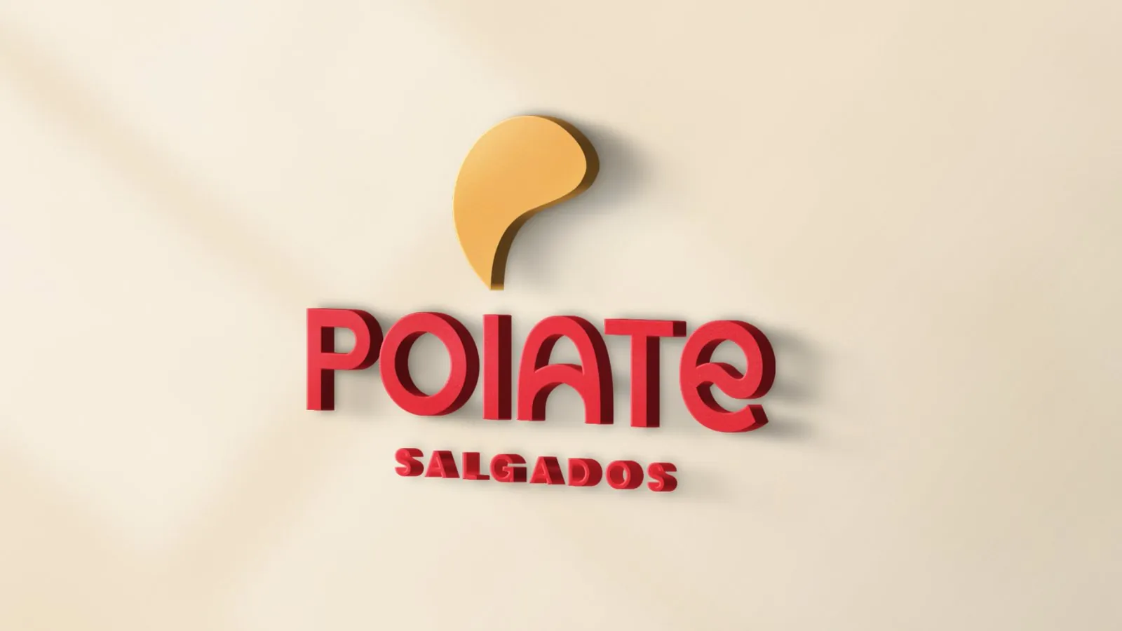
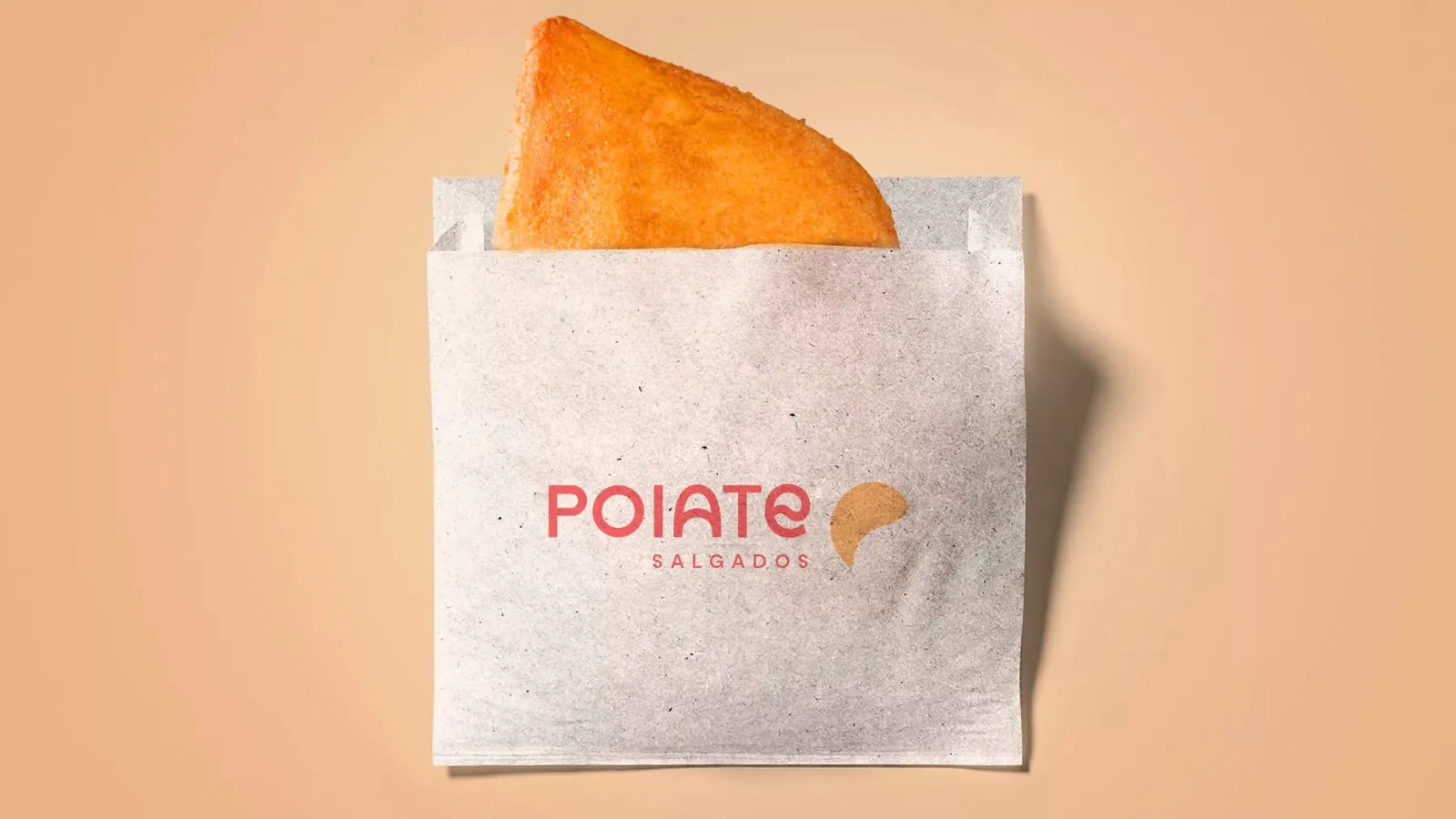
Poiate Salgados is associated with Iza Poiate Confeitaria. I developed the snack brand’s identity through Manto Studio, with applications for the shop and takeaway packaging.
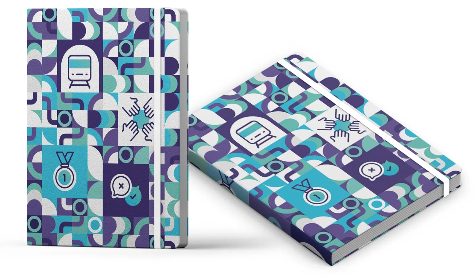
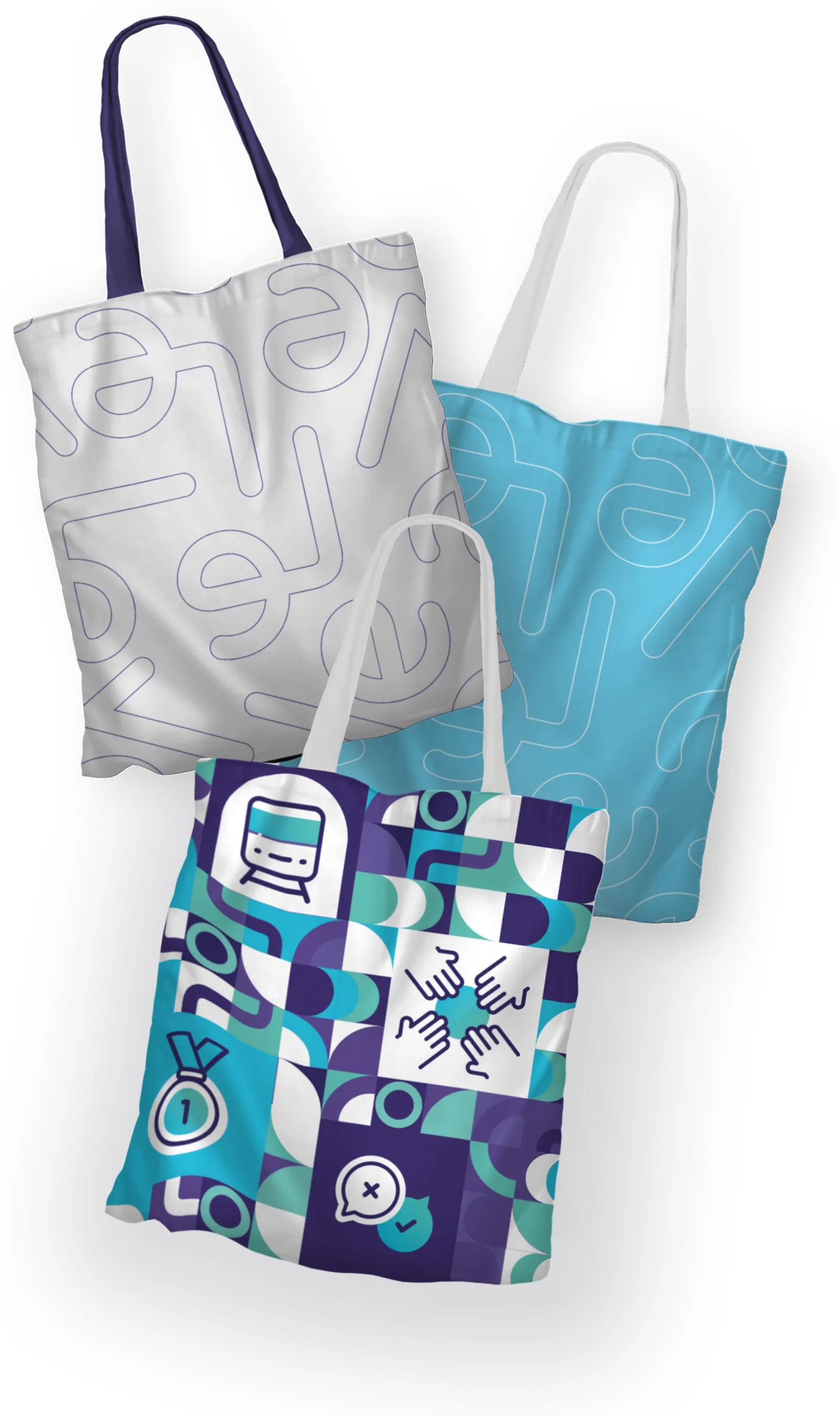
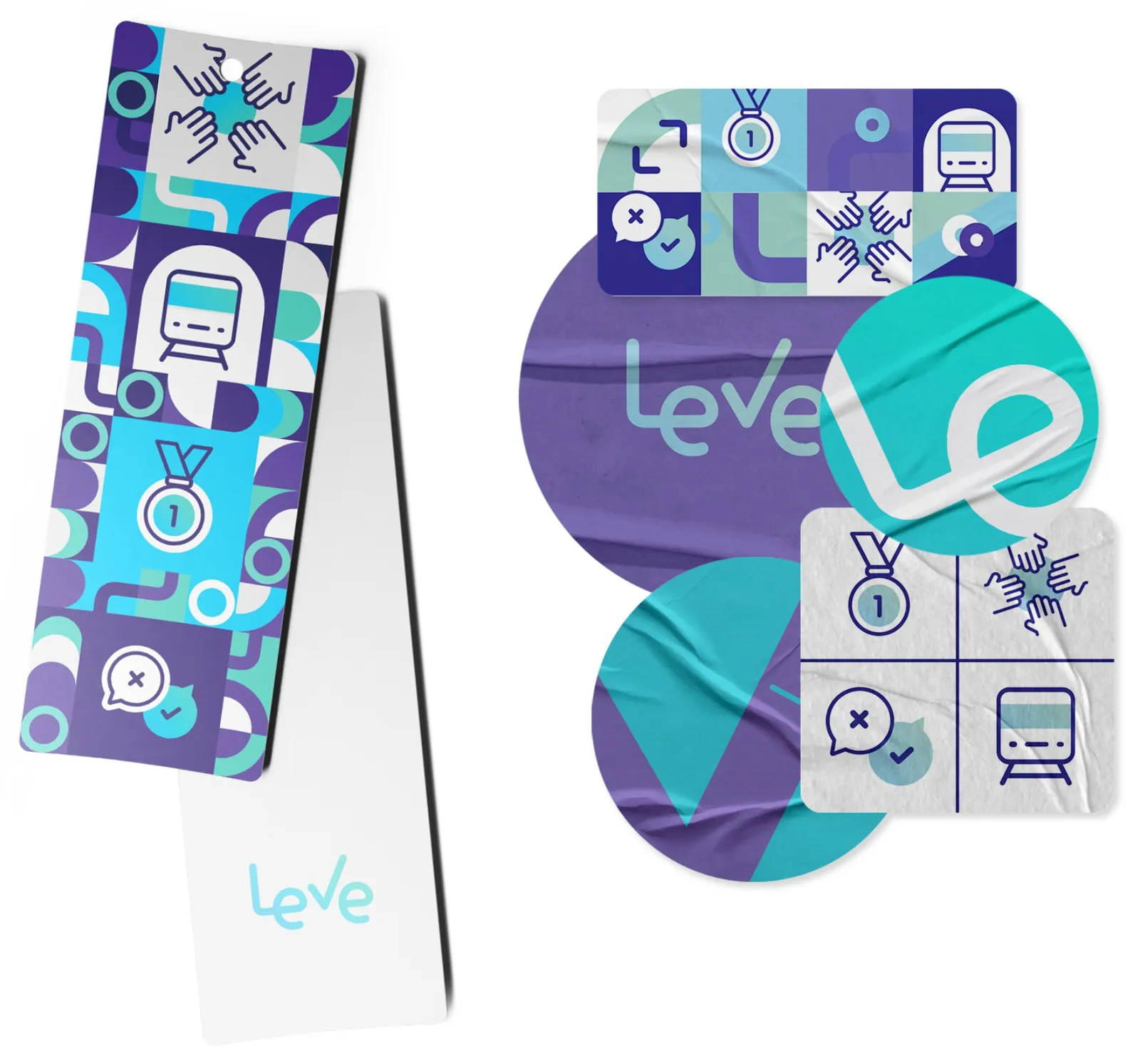
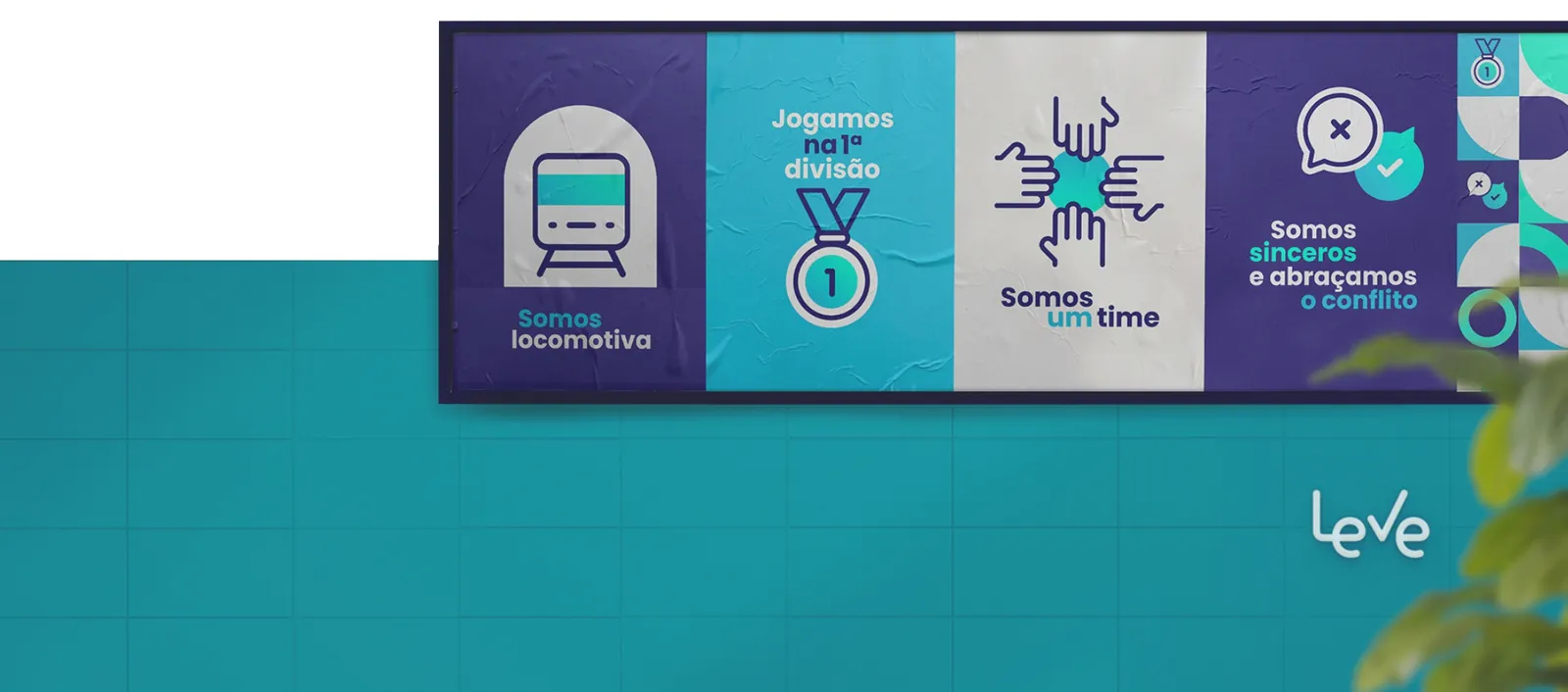
I was one of two designers responsible for Leve’s visual materials, including the complete onboarding kit.
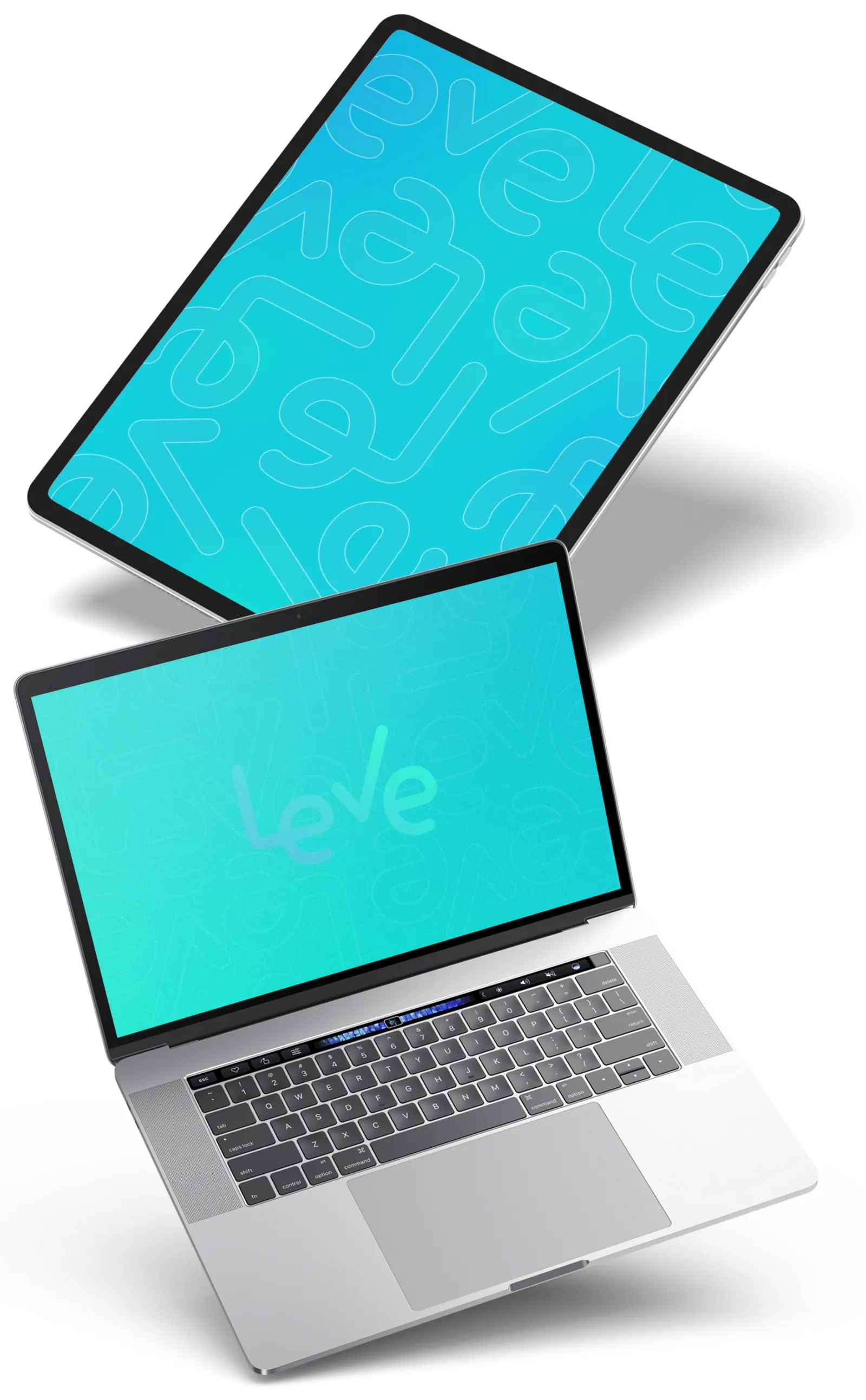
Key visuals for an internet provider’s Wi-Fi 6 and Wi-Fi 7 launches, designed at Bangboo.
Projects from the last nine years. Here’s what each project needed and how I approached it.
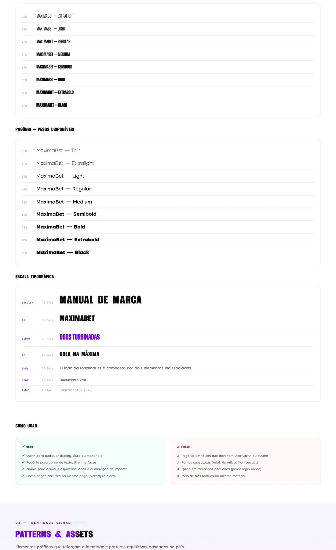
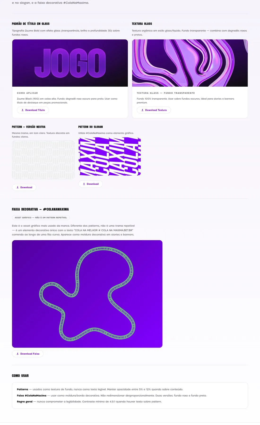
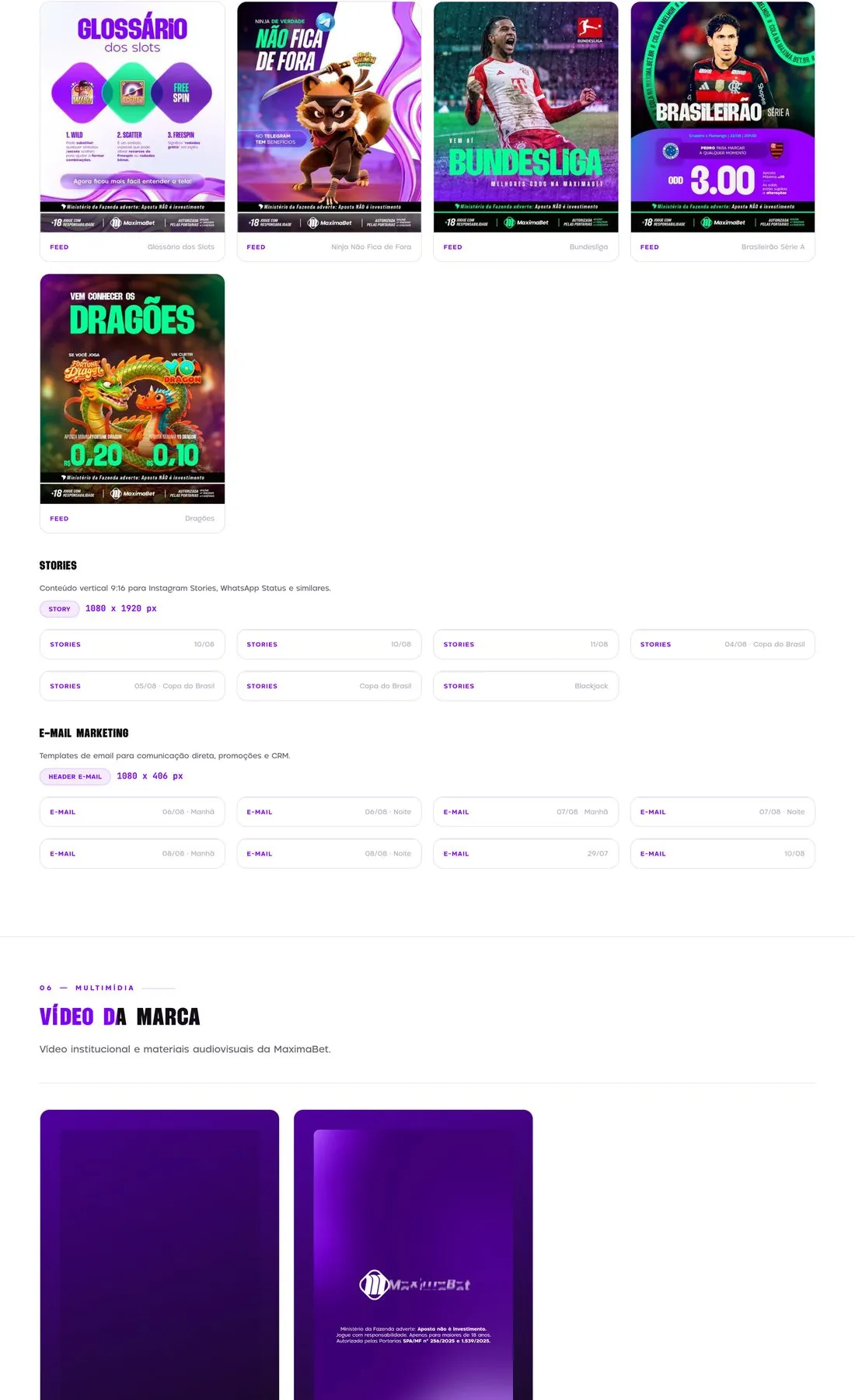
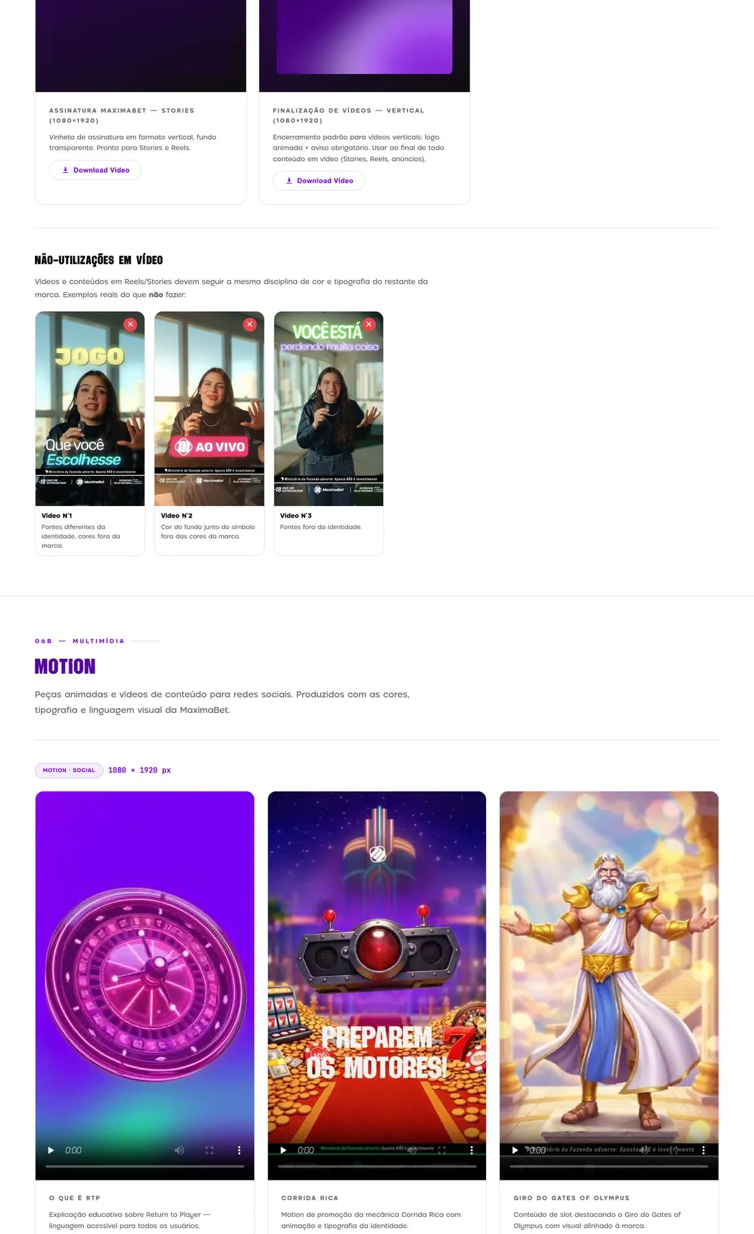
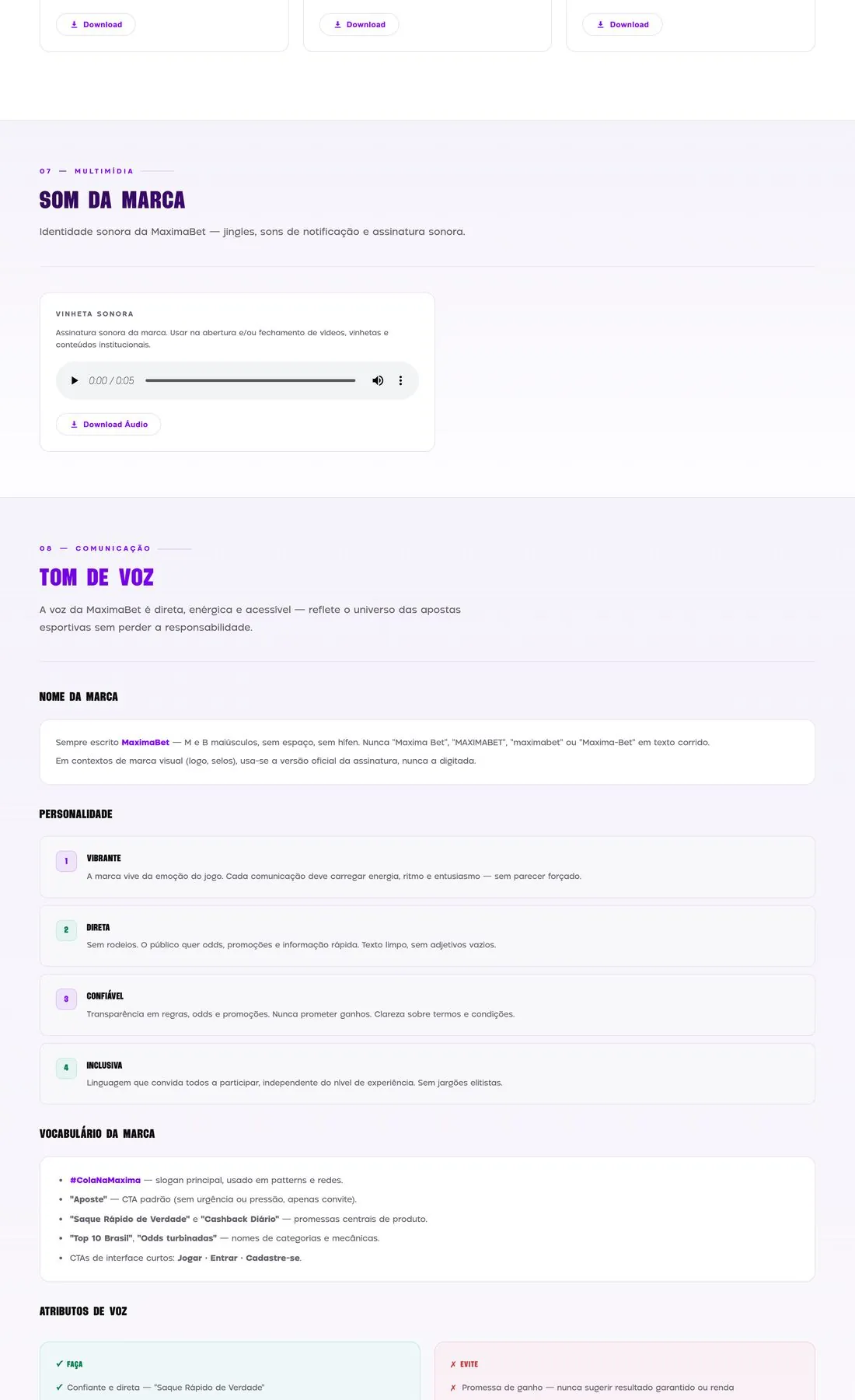
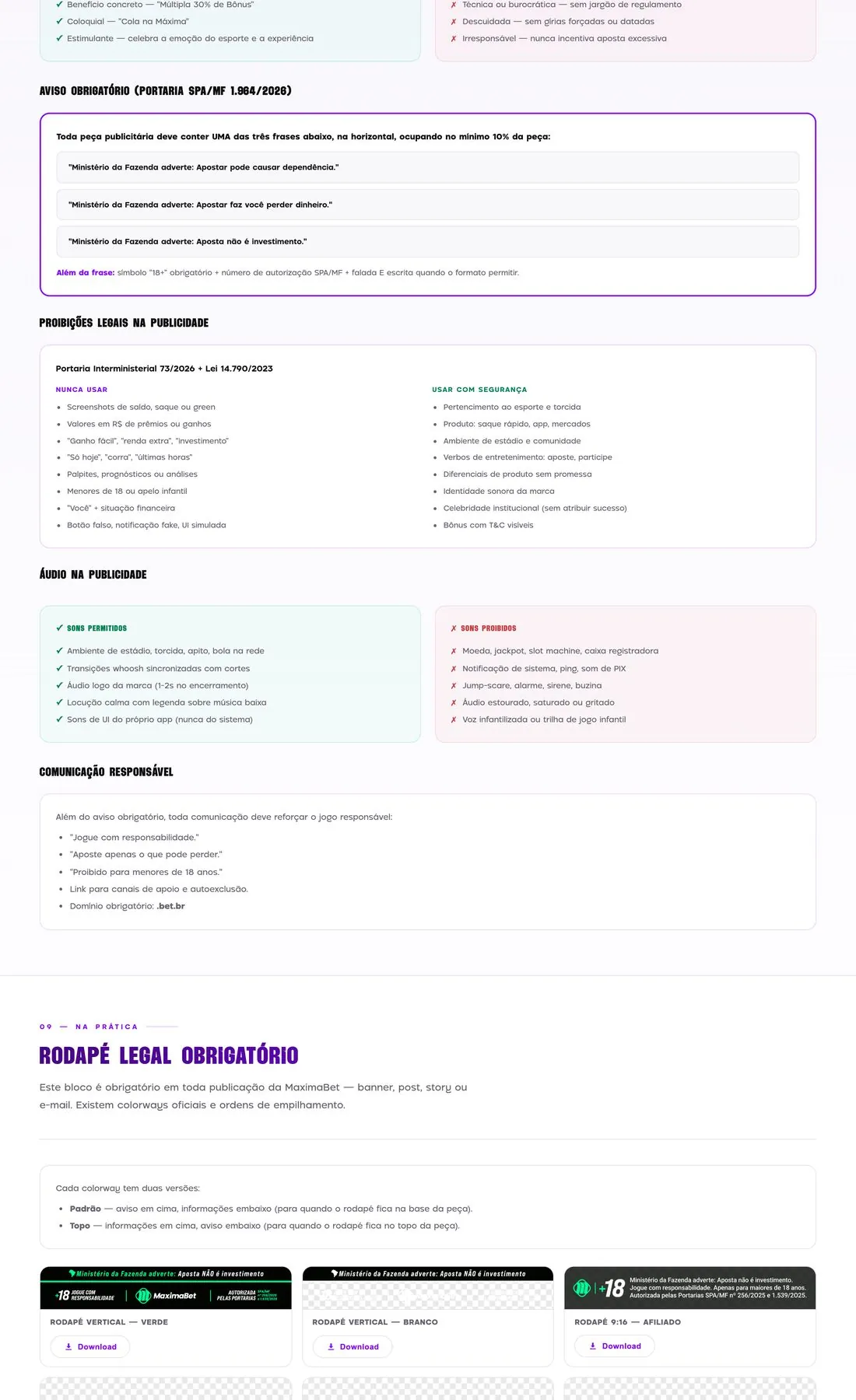
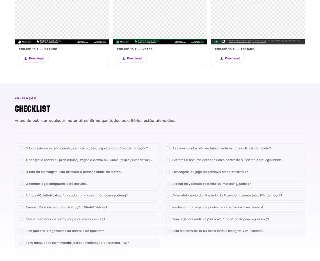
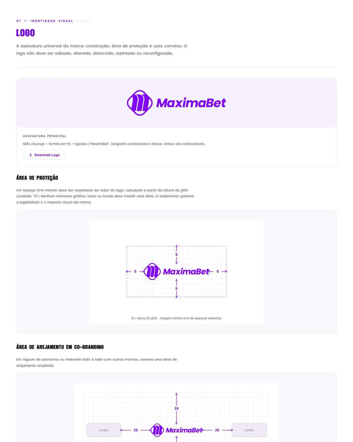
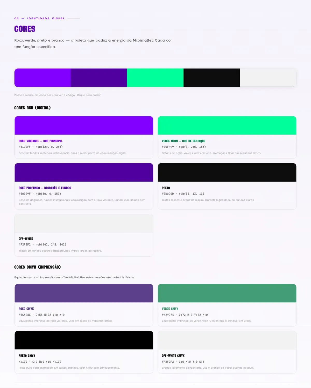
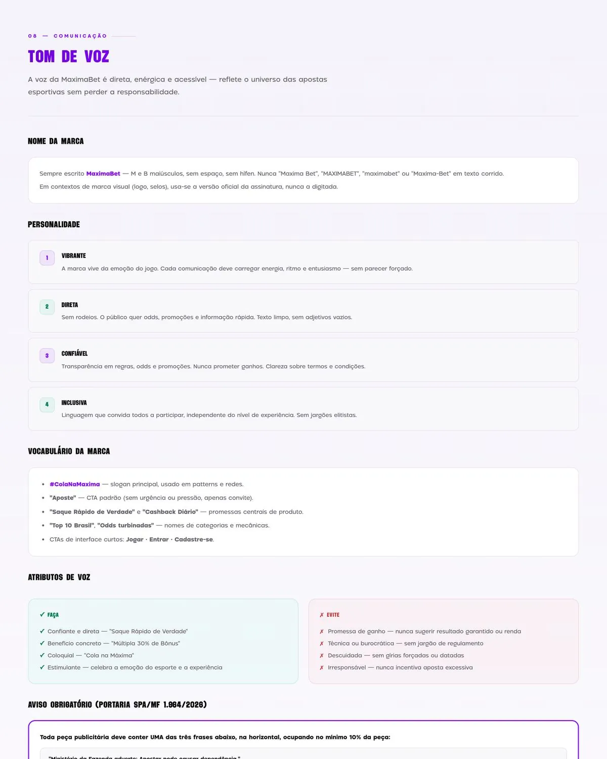
Maxima’s partners were applying the brand differently. I brought rules, assets and font downloads into its first interactive brand guide. Around 20 people used it, and materials became more consistent.
MaximaAt Bangboo, I evolved Fibercom’s Wi-Fi 6 campaign visual and created the Wi-Fi 7 launch key visual. The Wi-Fi 6 campaign lifted average transaction value by 43% and profit margin by 18%.
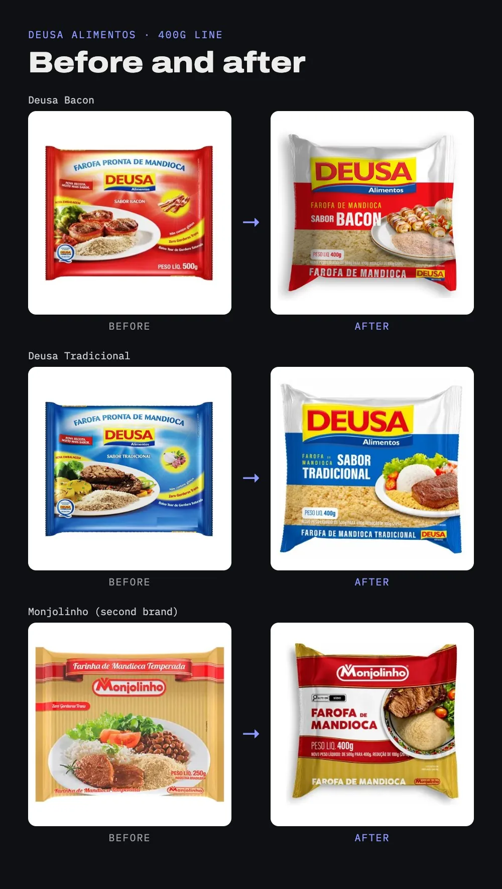
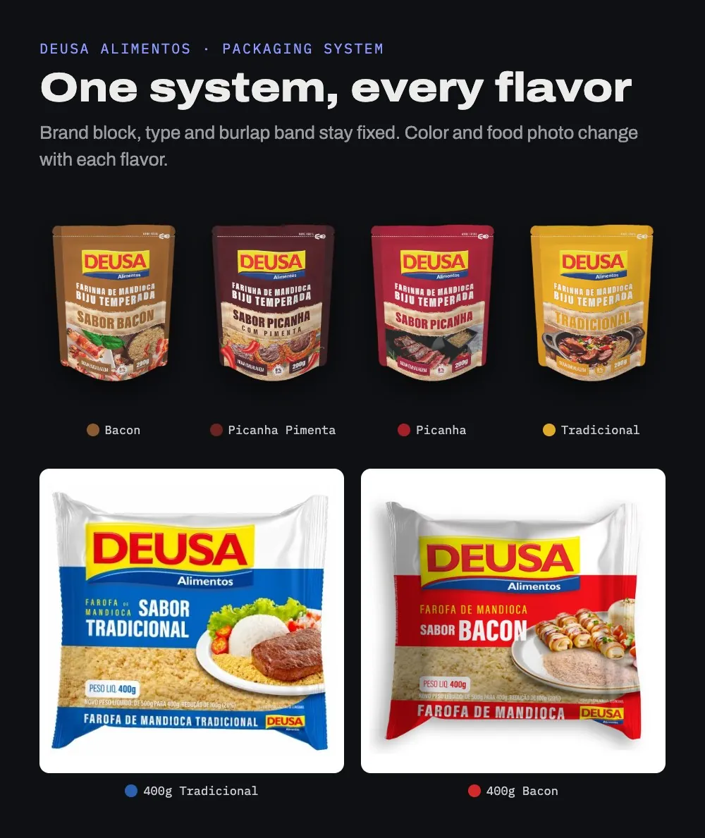
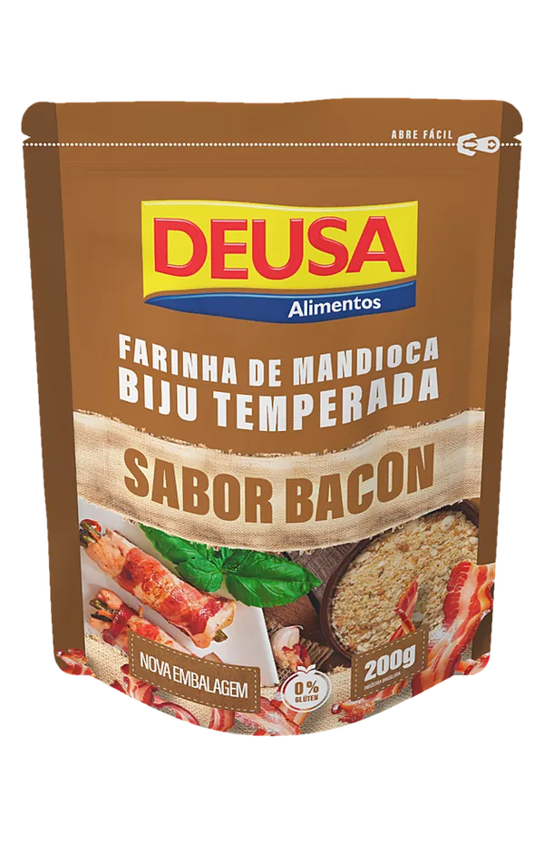
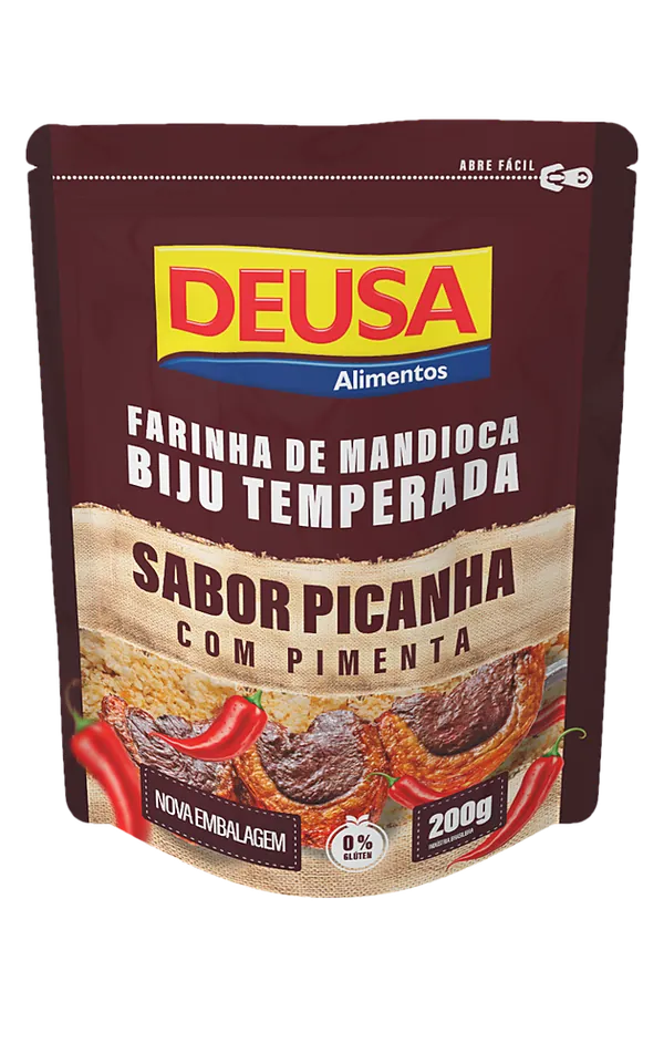
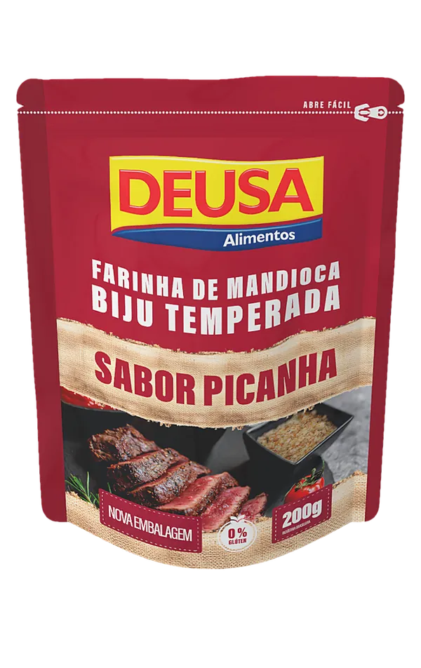
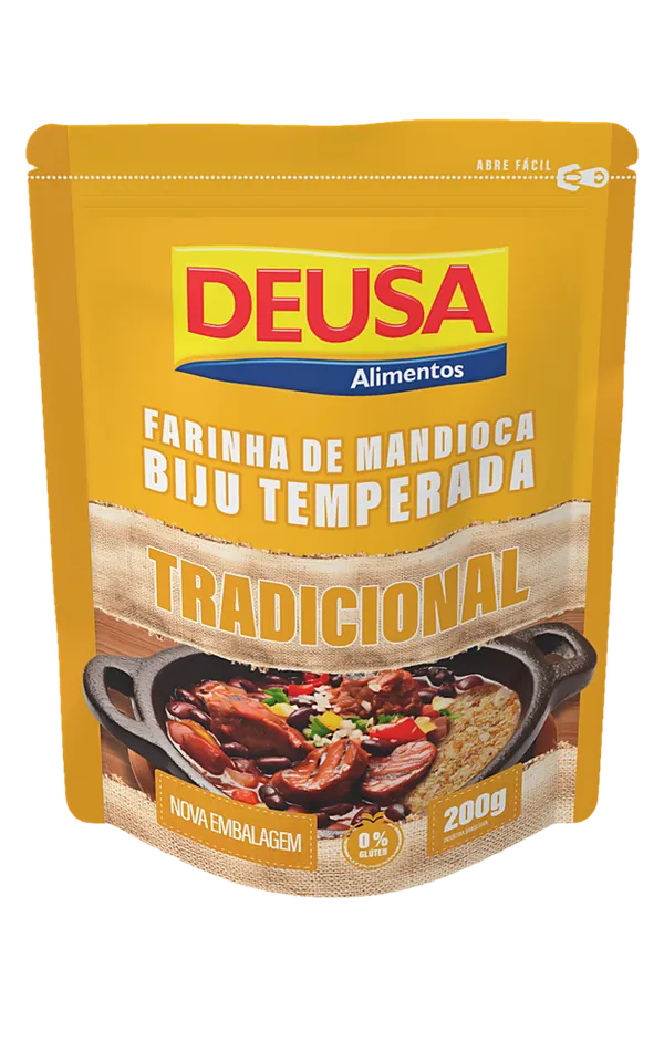
BangbooDeusa’s farofa packs had little shelf presence. At Bangboo, I redesigned seven packs across the Deusa and Monjolinho brands, using flavor-specific colors and imagery.
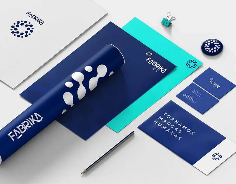
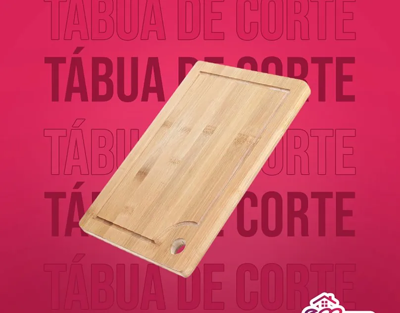
BangbooAt Fabrika, Em Casa Tem’s packaging redesign covered more than 50 products. I worked across the range while leading brand and campaign projects for eight accounts.
FabrikaLeve needed to explain financial products to people outside finance. I translated the information into presentations and HubSpot emails. I also applied the company’s identity to its complete print and digital onboarding kit.
LeveFor my independent TikTok Shop project, I needed to turn product images into short videos. I built a workflow that generates scripts and captions with Gemini, then produces vertical video.
IndependentTrinca needed visual materials across the company, with me as its sole visual designer. Working remotely, I applied the brand to internal communications and employer branding. I delivered presentations and materials for events and onboarding.
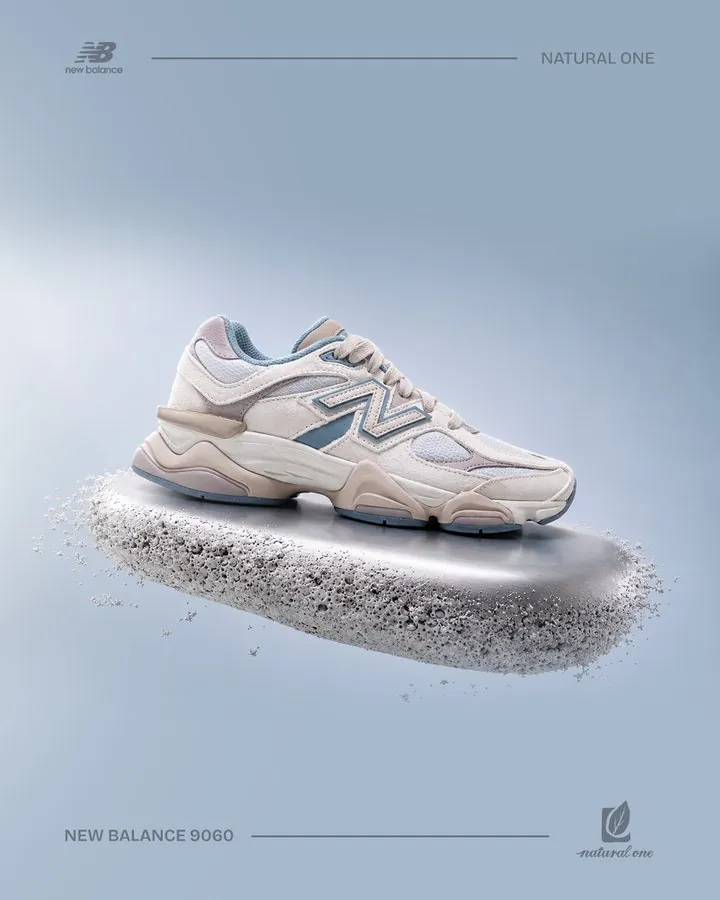
TrincaFor Natural One, a retail franchise in Paraná, I used Google Flow to generate images of New Balance sneakers for the store's social posts.
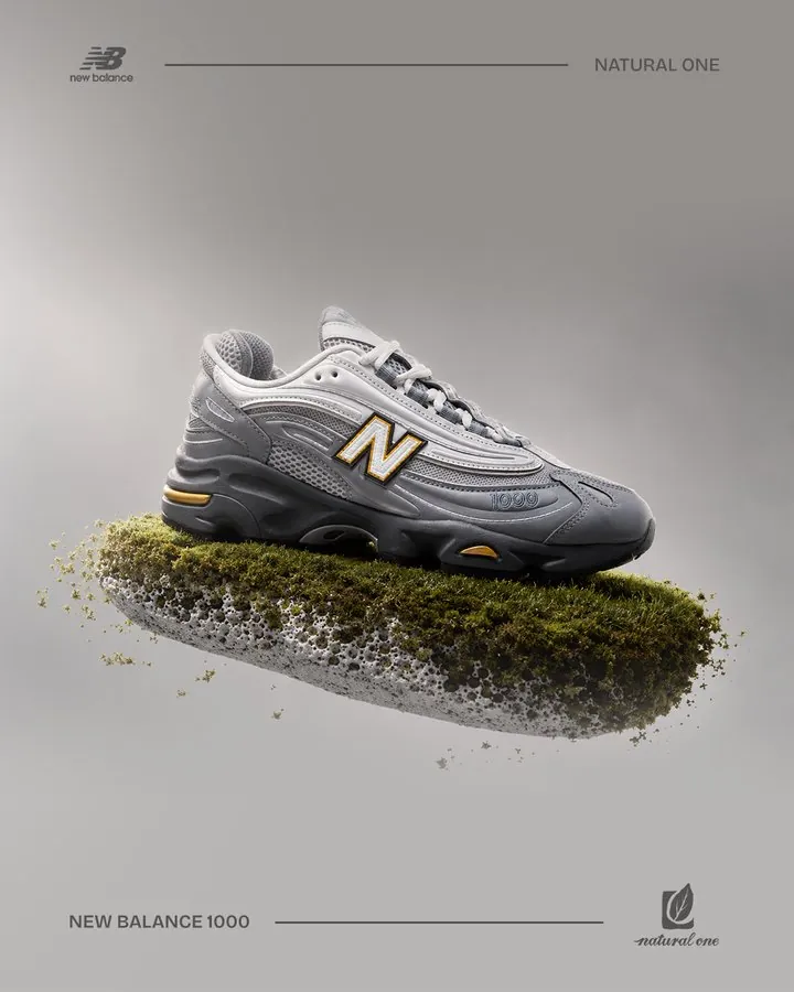
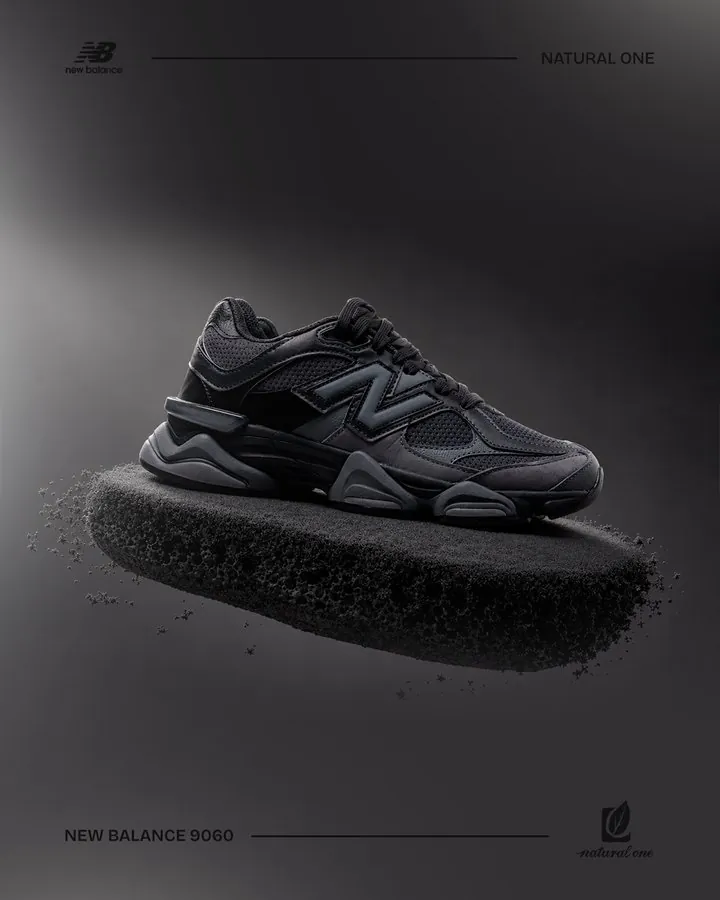
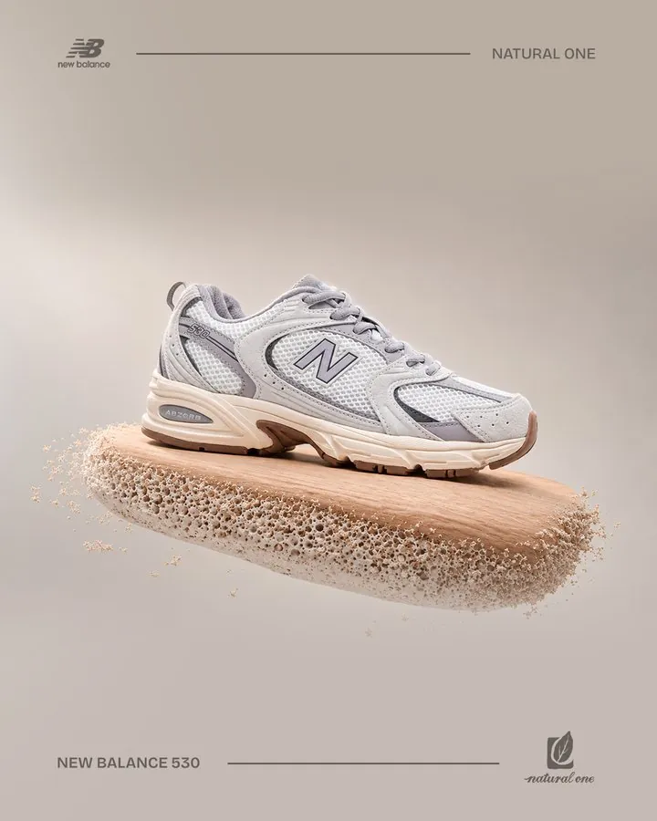
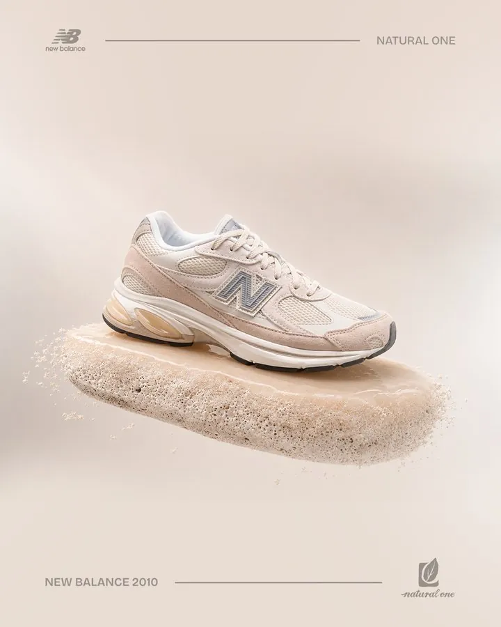
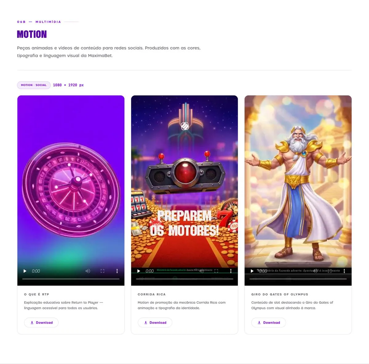
At Maxima, I used Higgsfield to generate images and video. My work included AI-assisted motion pieces for the interactive brand guide.
TikTok Shop videos
I create TikTok Shop videos with Gemini Omni Flash, using AI-generated characters with a consistent appearance.
I built the admin panels and automation for an independent TikTok Shop project. The system takes a product photo through to a finished vertical video with a script and caption.
I upload the product photo and TikTok Shop link, along with notes for Gemini.
Gemini generates the script and caption from the product details.
Veo generates the vertical video.
The system tracks generation jobs and retries failed requests.
The final panel groups finished videos by day. I can download the video and copy its caption and product details for posting.
I made product videos for Star Point, a surf shop in Maringá, featuring brands such as Hurley, Volcom, Approve and The Saint.
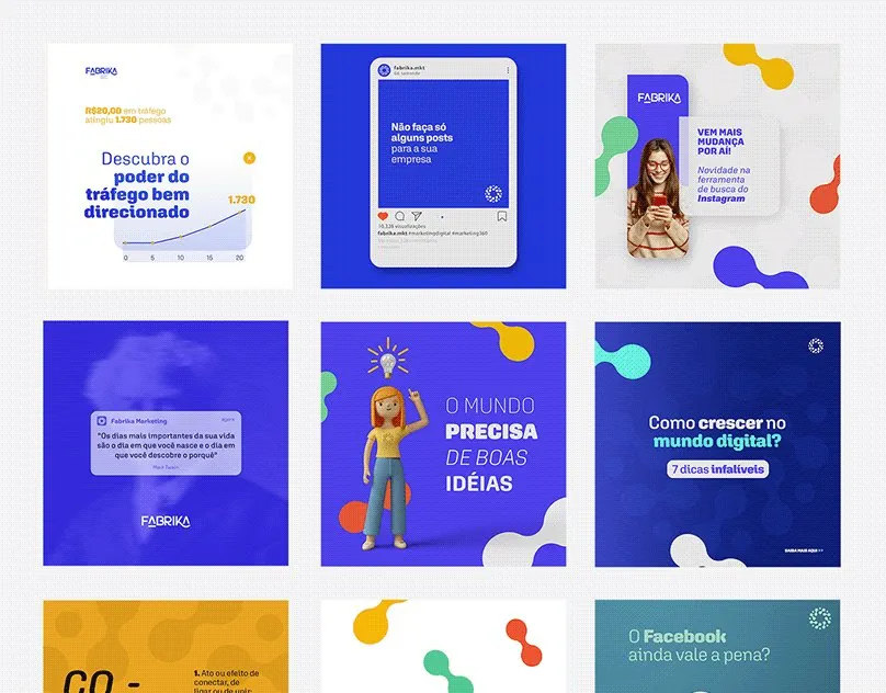
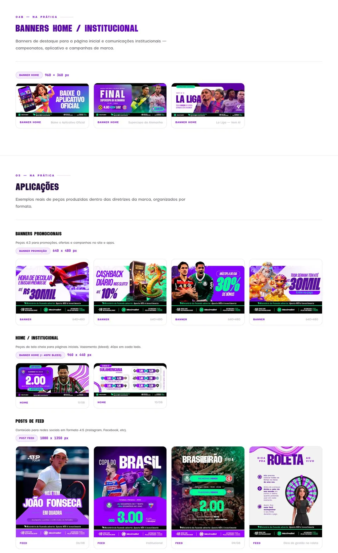
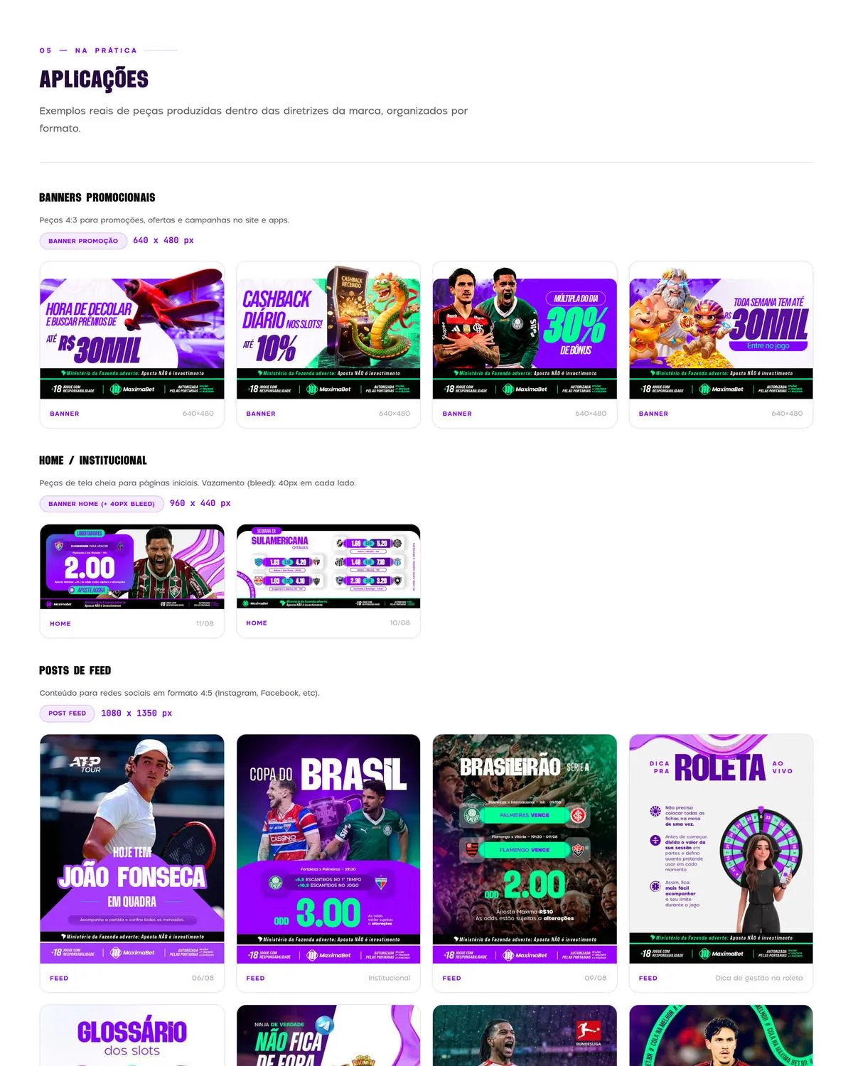
I produced around 200 designs per month, plus adaptations, for Maxima’s digital channels.
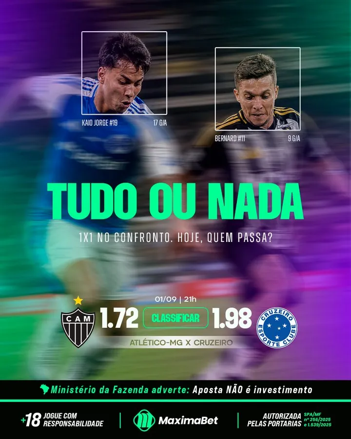
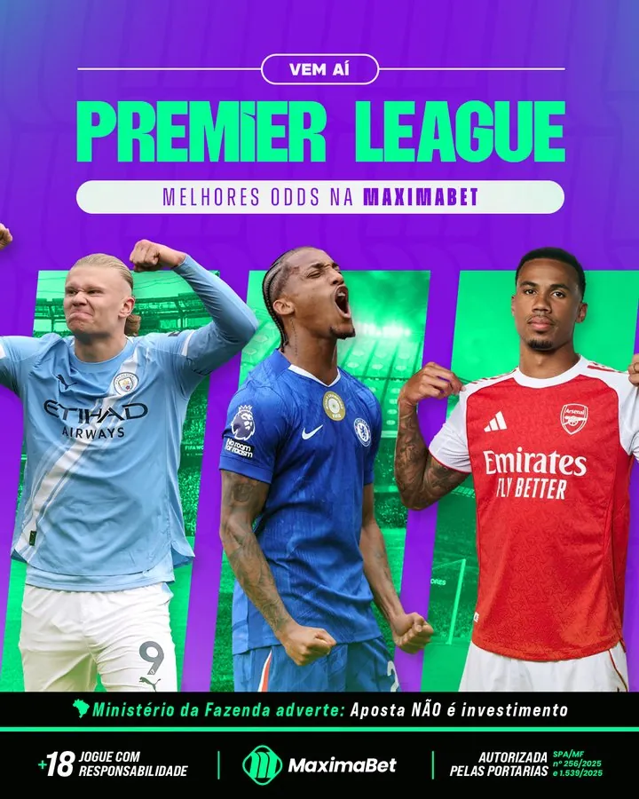
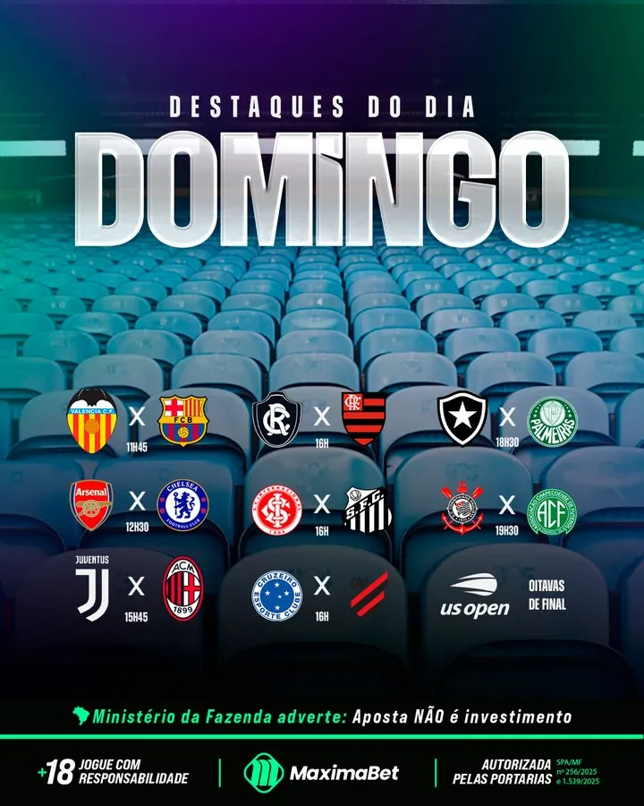
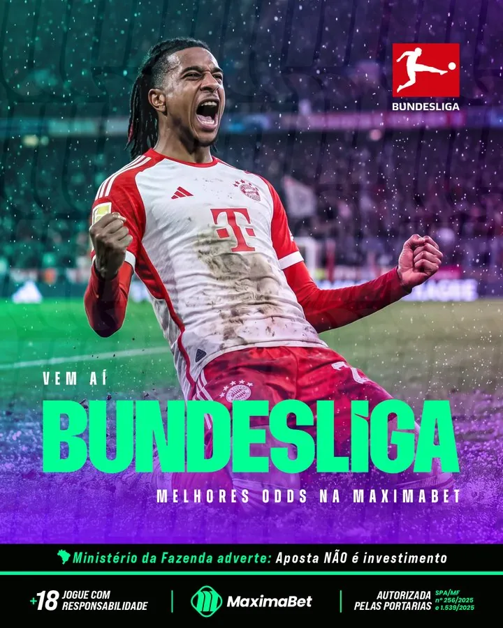
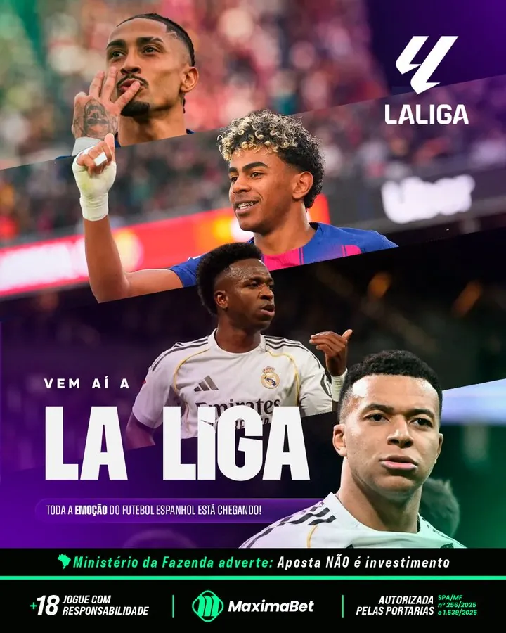
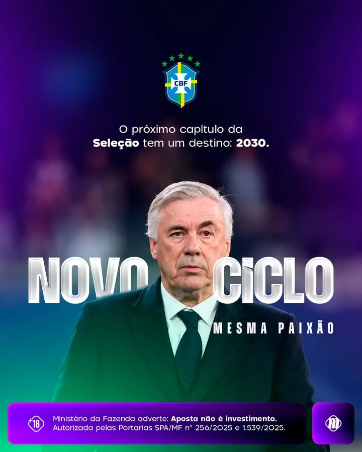
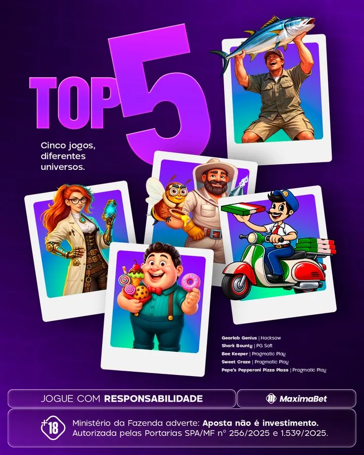
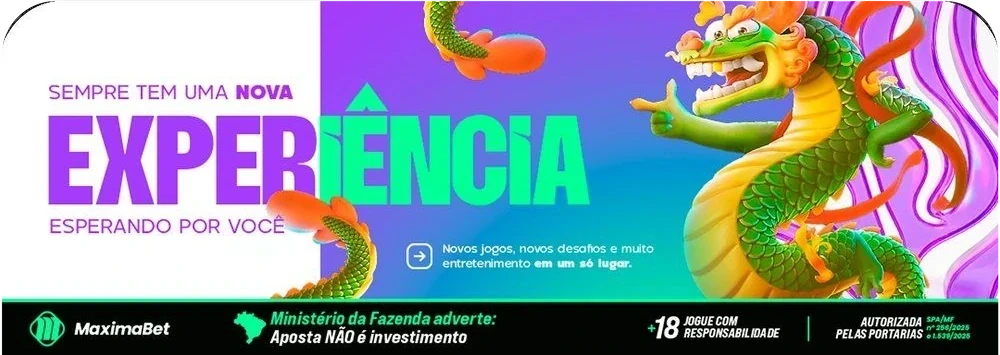
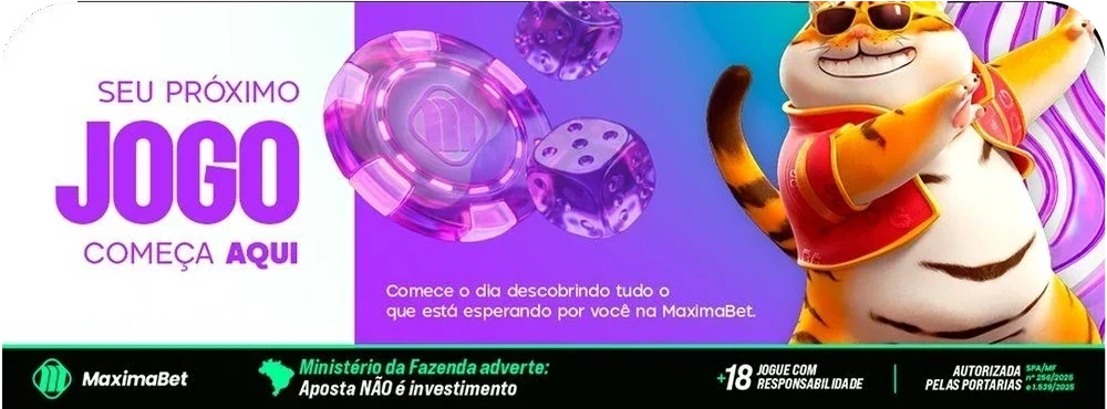
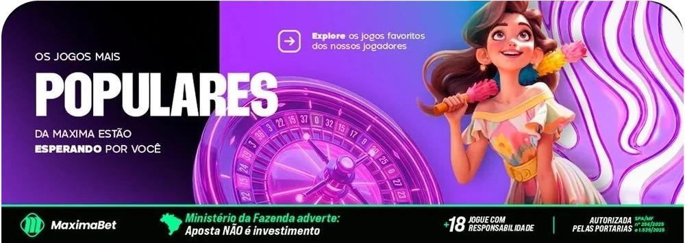
I produced around 200 designs per month and built Maxima’s first interactive brand guide in HTML, including brand sound. Around 20 people used it.
I developed brand identities and icon sets at Dzigna, alongside storyboards and AI-assisted mockups.
I designed for 10 accounts at Bangboo, including simultaneous seasonal campaigns. I reviewed and approved final work and mentored two junior designers.
As the only visual designer, I created materials for internal communications, employer branding, events and onboarding.
I was one of two designers at Leve, a fintech with around 80 employees. I created the complete print and digital onboarding kit, plus presentations and HubSpot emails.
I led branding and campaigns for eight accounts at once and redesigned the packaging for 50+ Em Casa Tem products.
I designed e-commerce and social media content, with work in product photography and retouching. At Ui! Gafas, I was the only designer and also produced email content and motion graphics.
Through Manto Studio, I’ve created 30+ visual identities from scratch. I handle the client relationship and every stage of the design work, from the brief to final delivery.
Brand identity and guidelines, campaigns, paid ads, packaging, editorial design, presentations, icons, motion graphics, web assets
Figma, Illustrator, Photoshop, InDesign, After Effects, Premiere Pro, Lightroom, Framer, HubSpot, Ableton Live
Higgsfield, Veo 3.1, Gemini, Nano Banana, Seedance, Kling, Wan, Firefly, ComfyUI, Claude, ChatGPT
Alongside motion design, I produce electronic music in Ableton Live and have given a one-hour talk on sound branding.
Visual Identity Design, Marcelo Kimura (ID Class); Branding & Strategy Workshop, Ana Couto; Design & Motion Strategy, Lucas Rosa (Primeira Classe).
Hi, I’m Matheus. I’m looking for a remote senior design role with an international team.
© Matheus Mantovan · Maringá, Brazil · UTC−3
I was one of two designers responsible for Leve’s visual materials. I designed the complete onboarding kit in digital and print formats.
Leve (acquired by Neon) offered payroll-deducted loans and had around 80 employees. The onboarding kit brought the company’s identity and values into materials for employees.
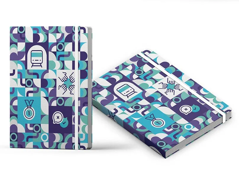
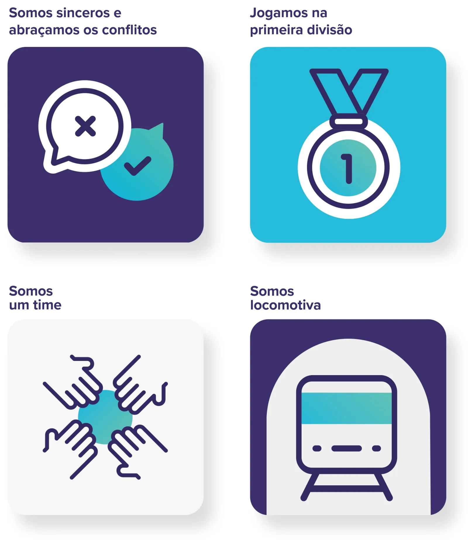
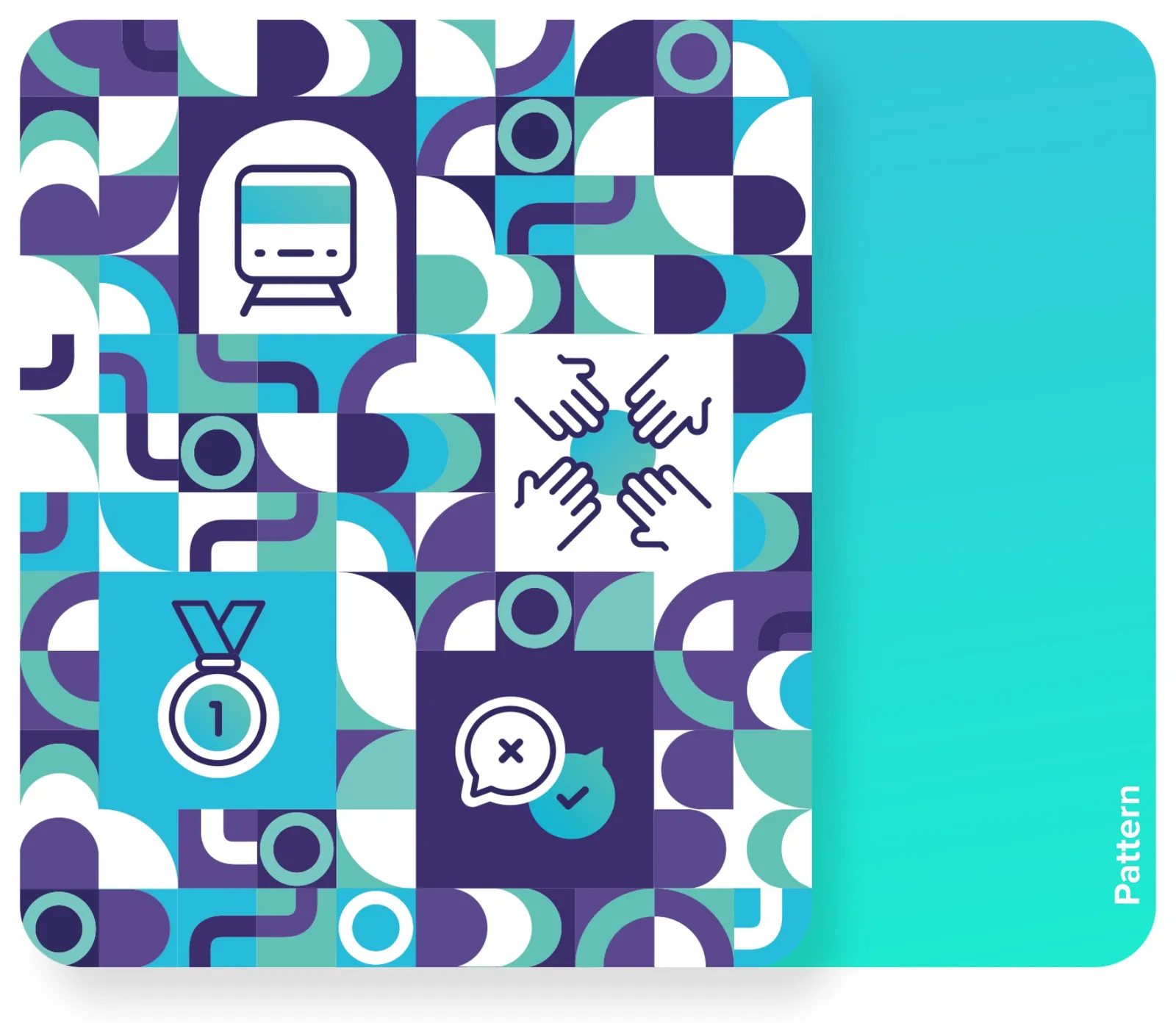
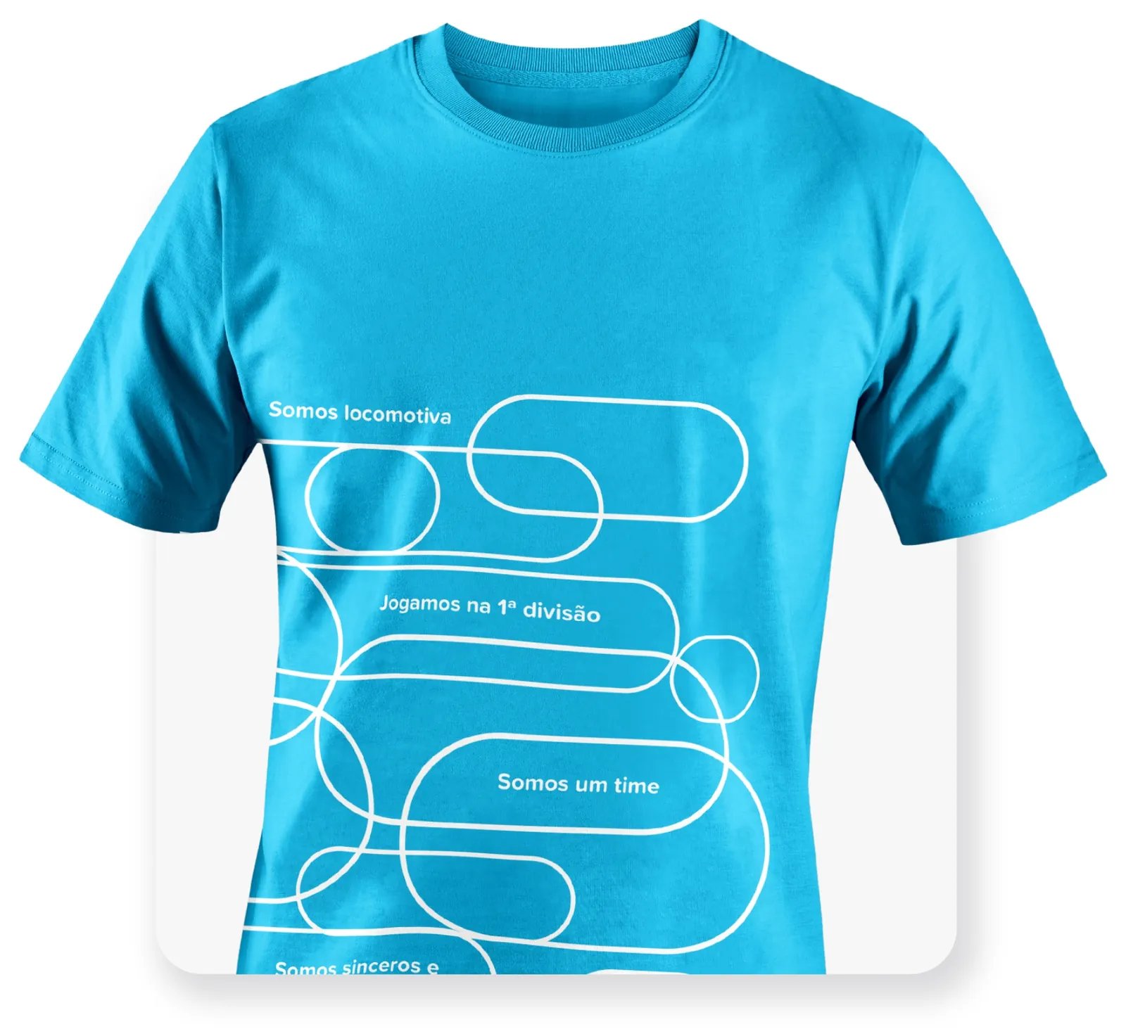
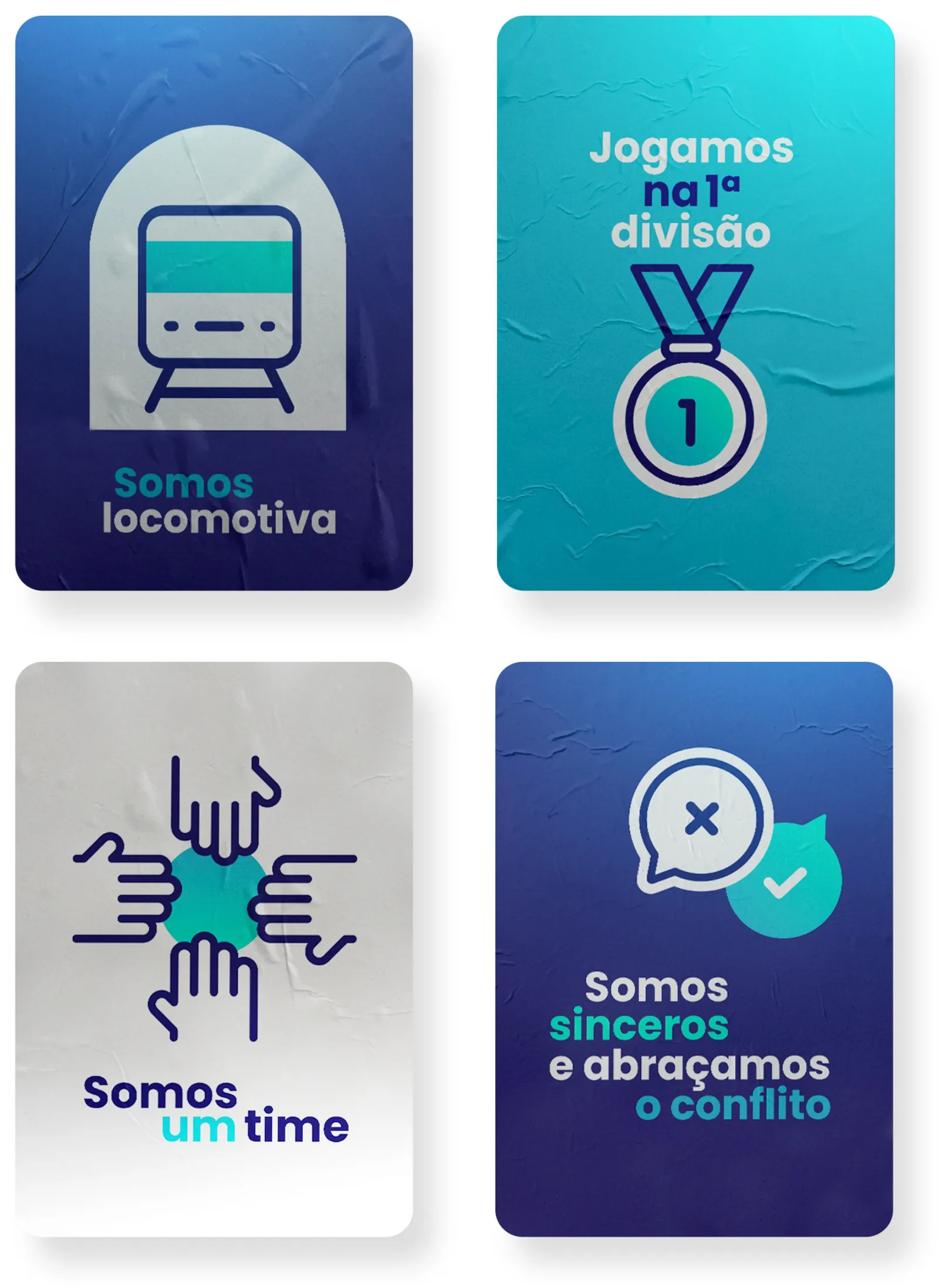
I applied the illustrated company values to the onboarding kit and repeated the identity’s pattern across the pieces. I carried those elements into both print and digital materials, keeping the kit connected visually.
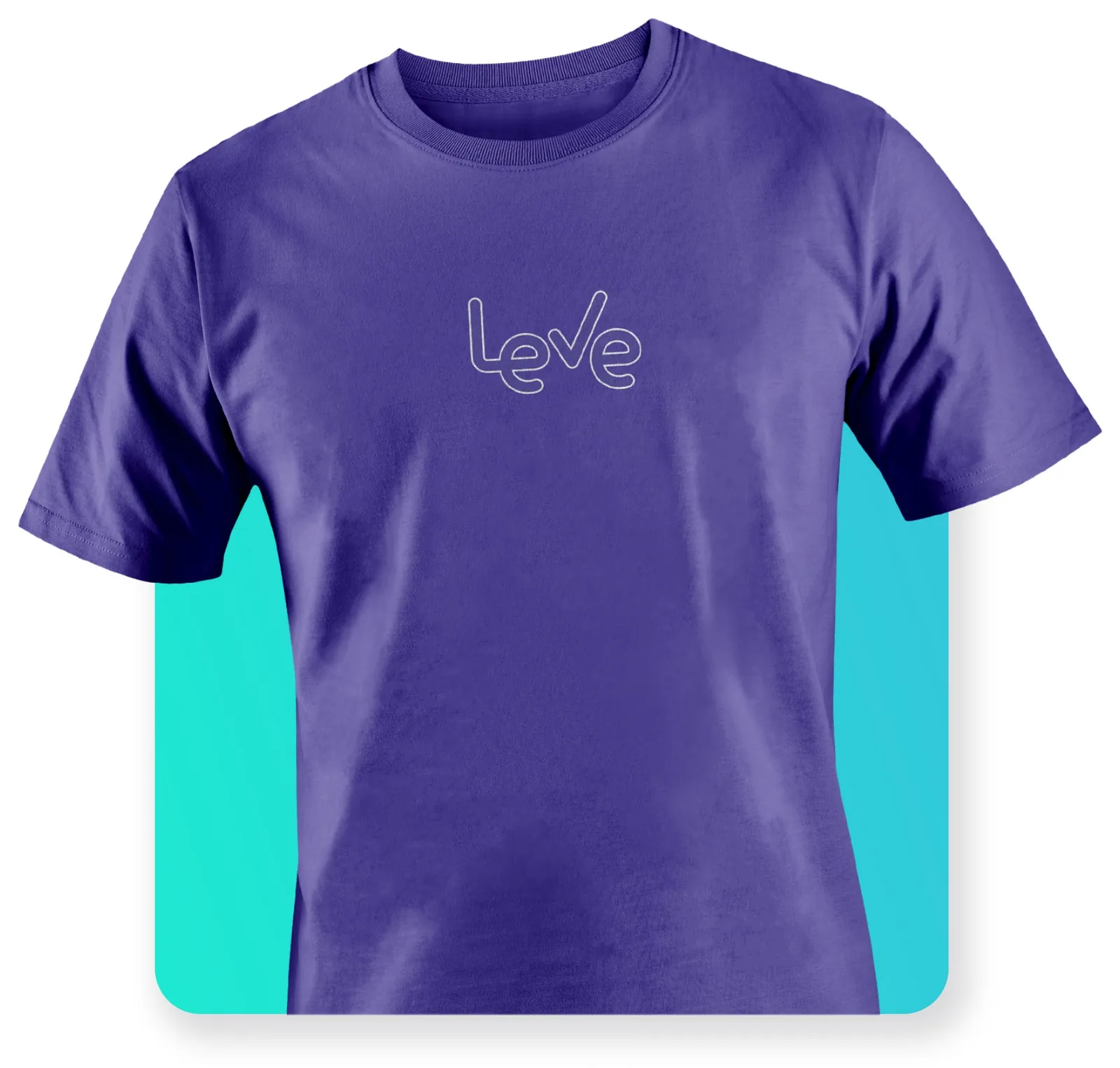
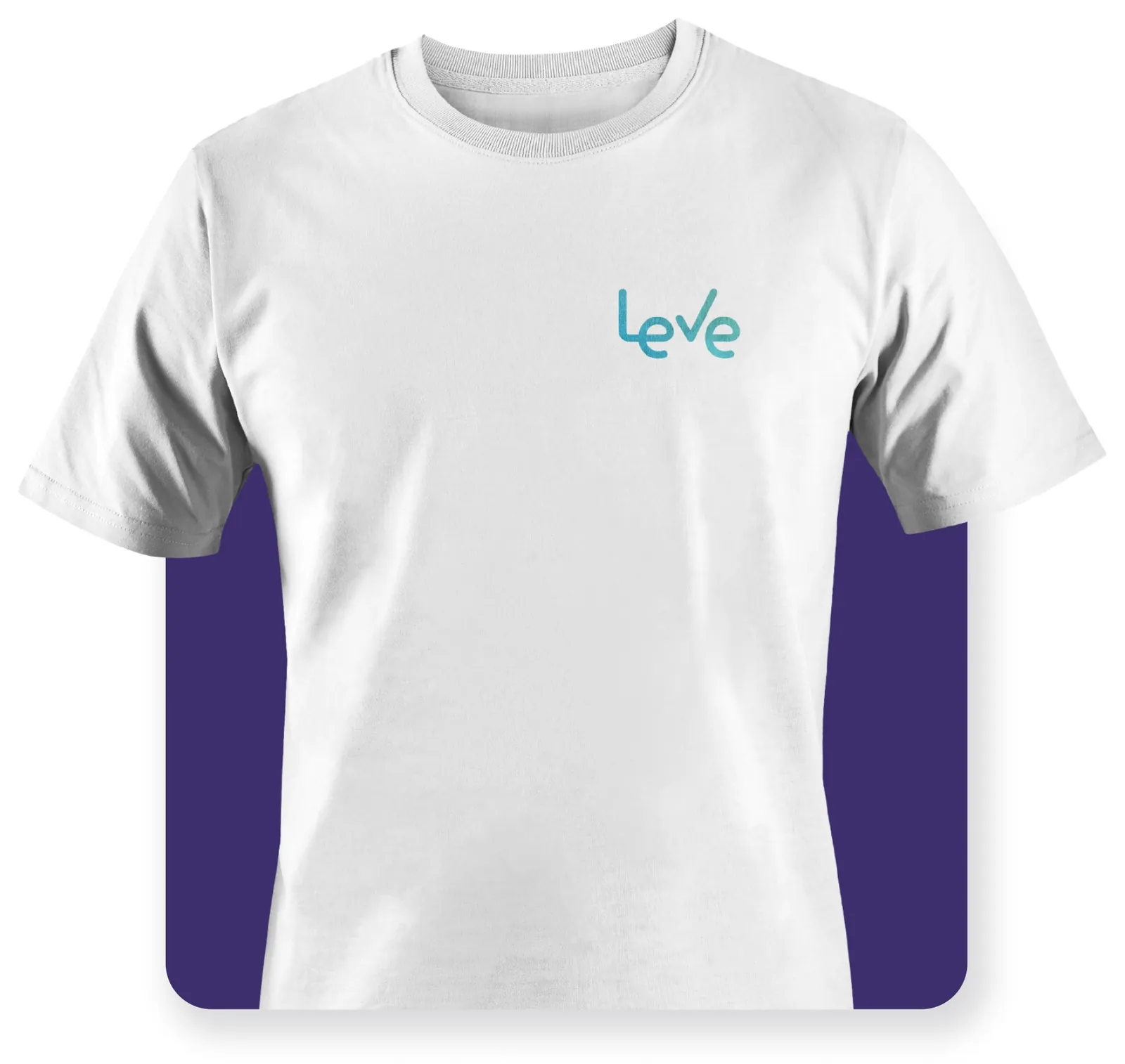
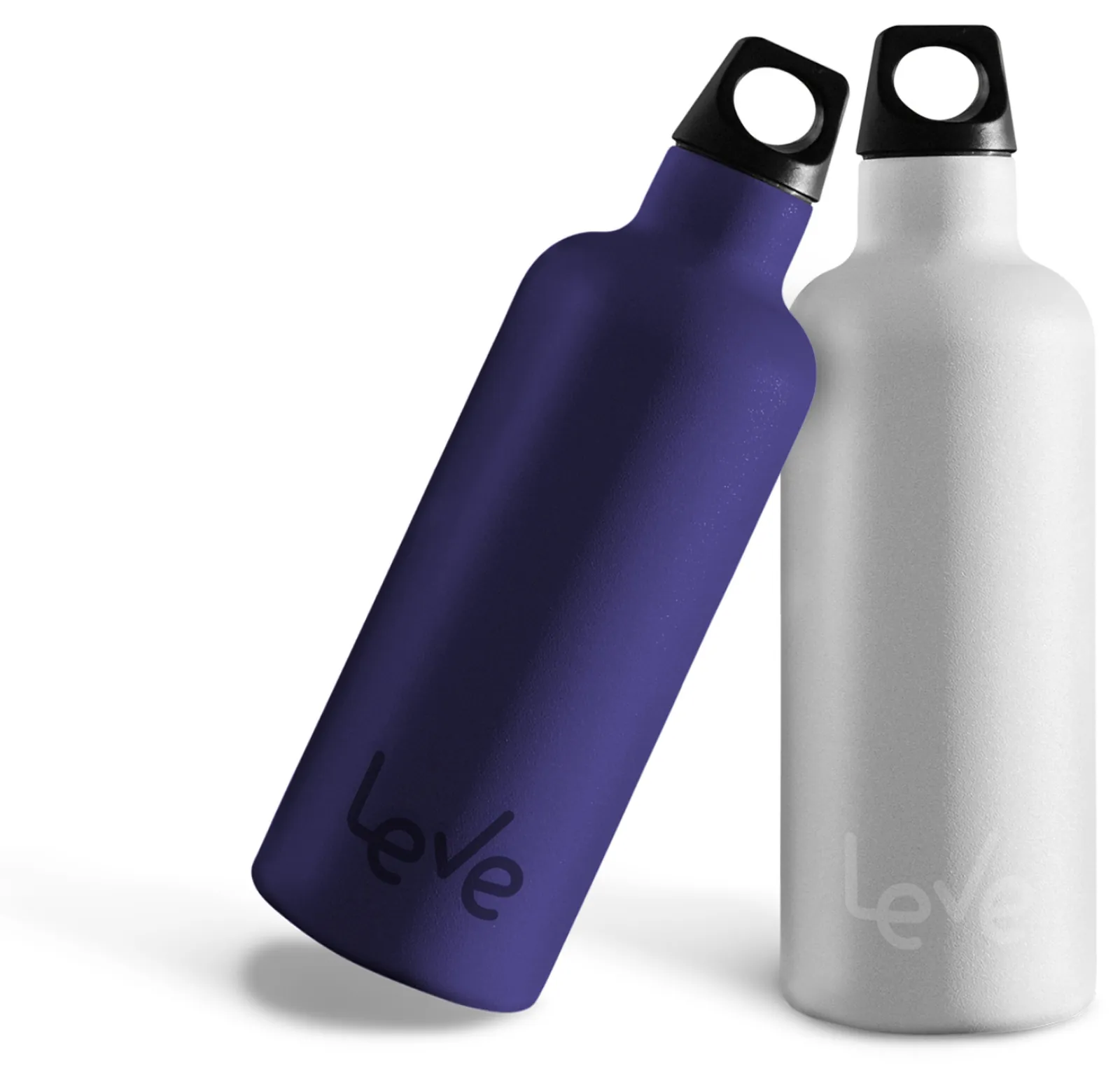
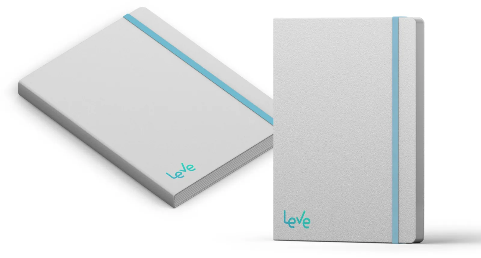
The kit includes tote bags, shirts and notebooks, with bottles, posters and digital materials completing the set.
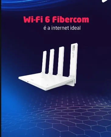
At Bangboo, I designed pieces for the continuation of Fibercom’s Wi-Fi 6 launch campaign. Later, I created the visual for the Wi-Fi 7 launch.
The first Wi-Fi 6 visual showed the router on a technical background. It explained the product, but not what changes at home.
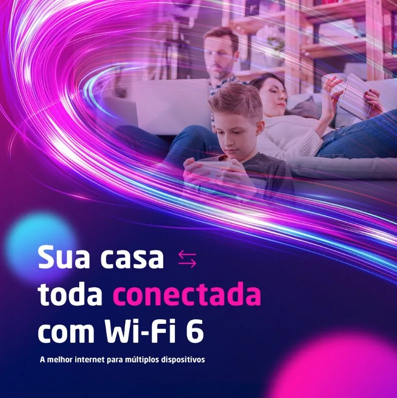
I moved the visual to a family using several devices at once, with trails of light connecting them. The headline speaks to the benefit: “Sua casa toda conectada com Wi-Fi 6” (Your whole home connected with Wi-Fi 6).
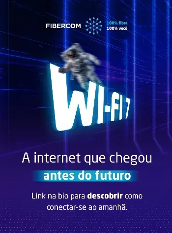
For Wi-Fi 7, I used an astronaut and the line “A internet que chegou antes do futuro” (The internet that arrived before the future).
Bangboo reports that the Wi-Fi 6 launch campaign raised the average ticket by 43% and profit margin by 18%. The result belongs to the whole campaign; my part was the visual for its continuation.
At Bangboo, I redesigned seven farofa packs: four 200g Deusa pouches, two 400g Deusa packs and one 400g pack for Monjolinho, Deusa Alimentos’ second brand.
The old packaging had little presence on the shelf next to competing products. The main competitor was Yoki's Caseiríssima line.
Yoki’s Caseiríssima was the main competitor on the shelf. I gave each Deusa flavor its own color and food imagery to make the flavors easier to tell apart and improve shelf presence.
The before-and-after comparison shows the three 400g redesigns. The system panel brings the six Deusa packs together.
I produced around 200 designs per month, plus adaptations, for Maxima’s digital channels.
There was no brand guide, and partners were applying the brand differently.
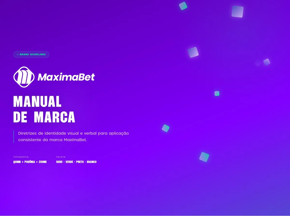
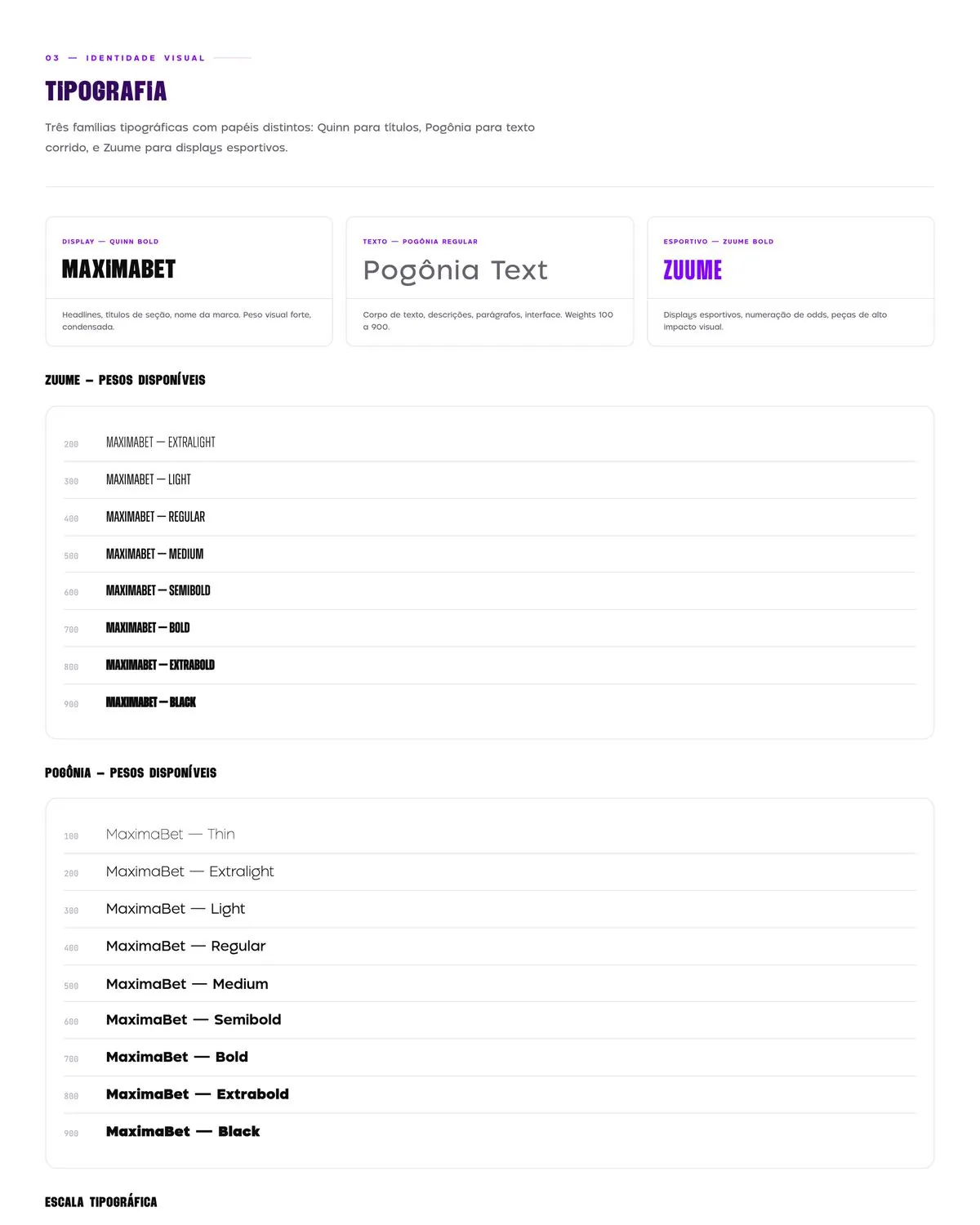
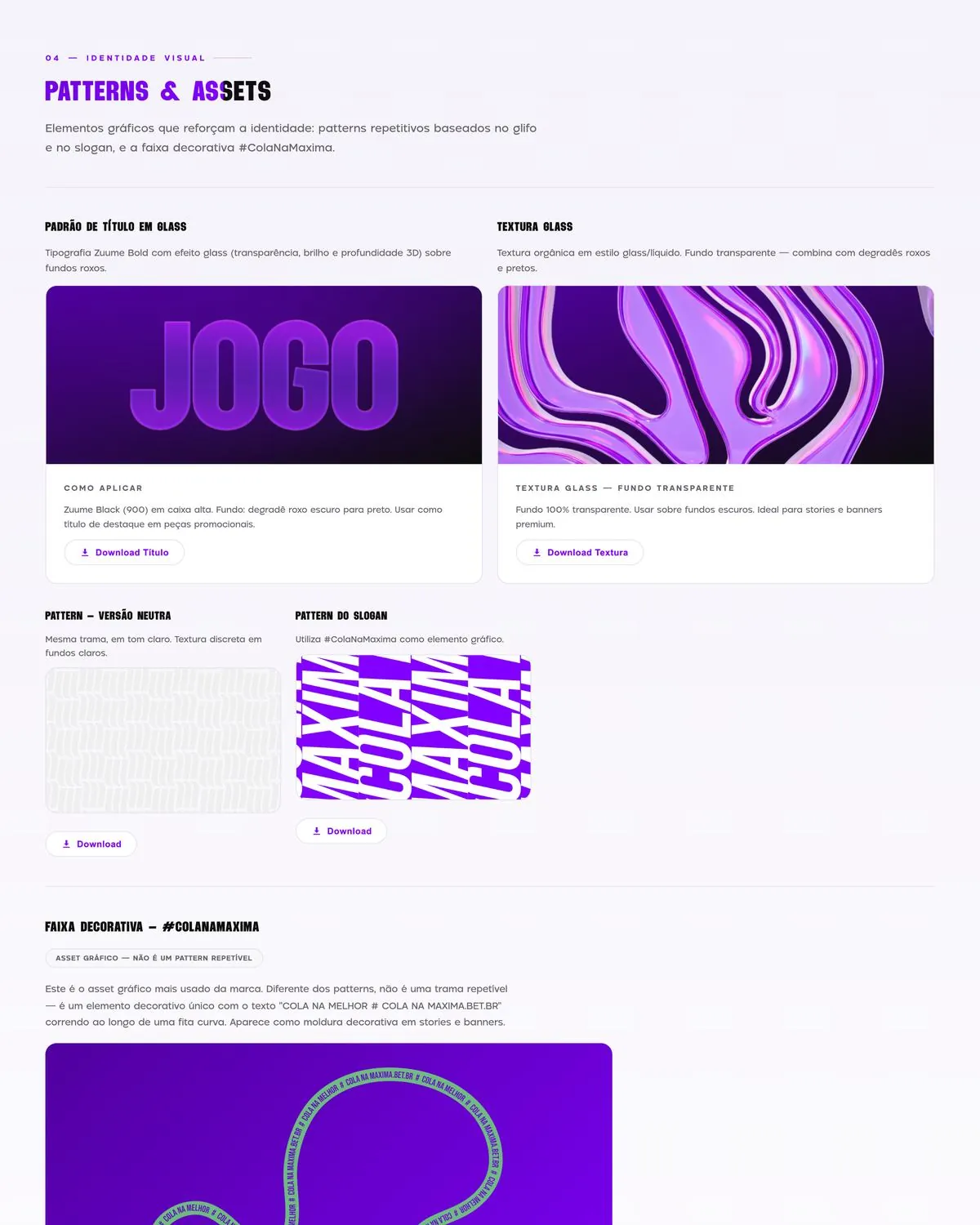
I built an interactive brand guide in HTML with 11 numbered sections and a checklist. It combines visual rules, brand sound and betting-advertising rules, with font downloads and examples of prohibited uses.
The guide reached around 20 users, including partners and the internal team. Materials became more consistent, with the correct brand fonts.
Scope: visual identity, from brief to final files · Manto Studio
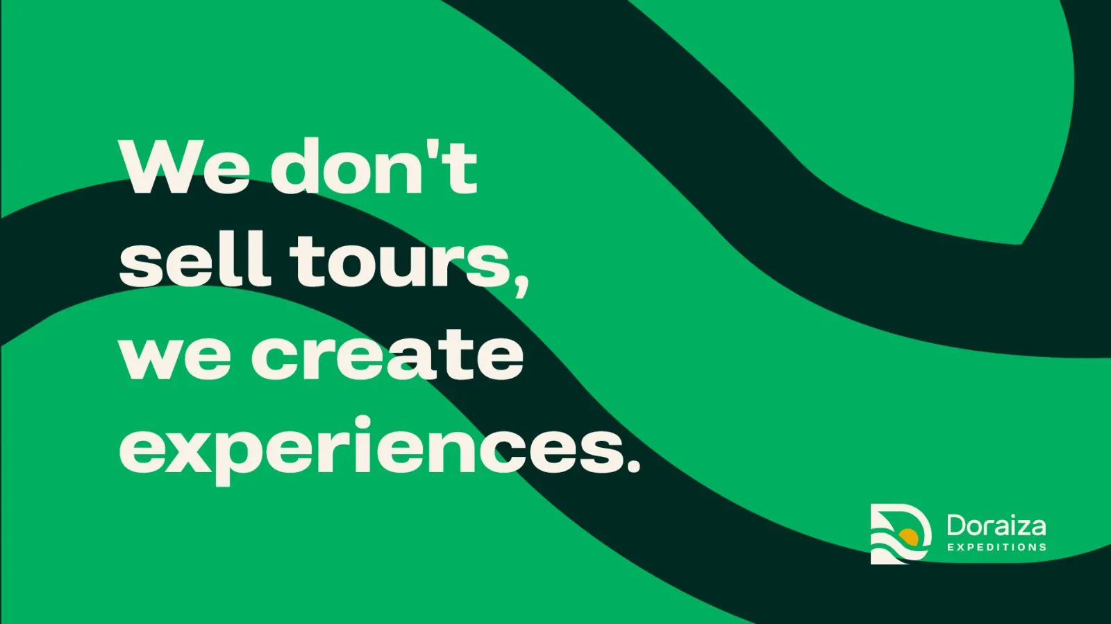
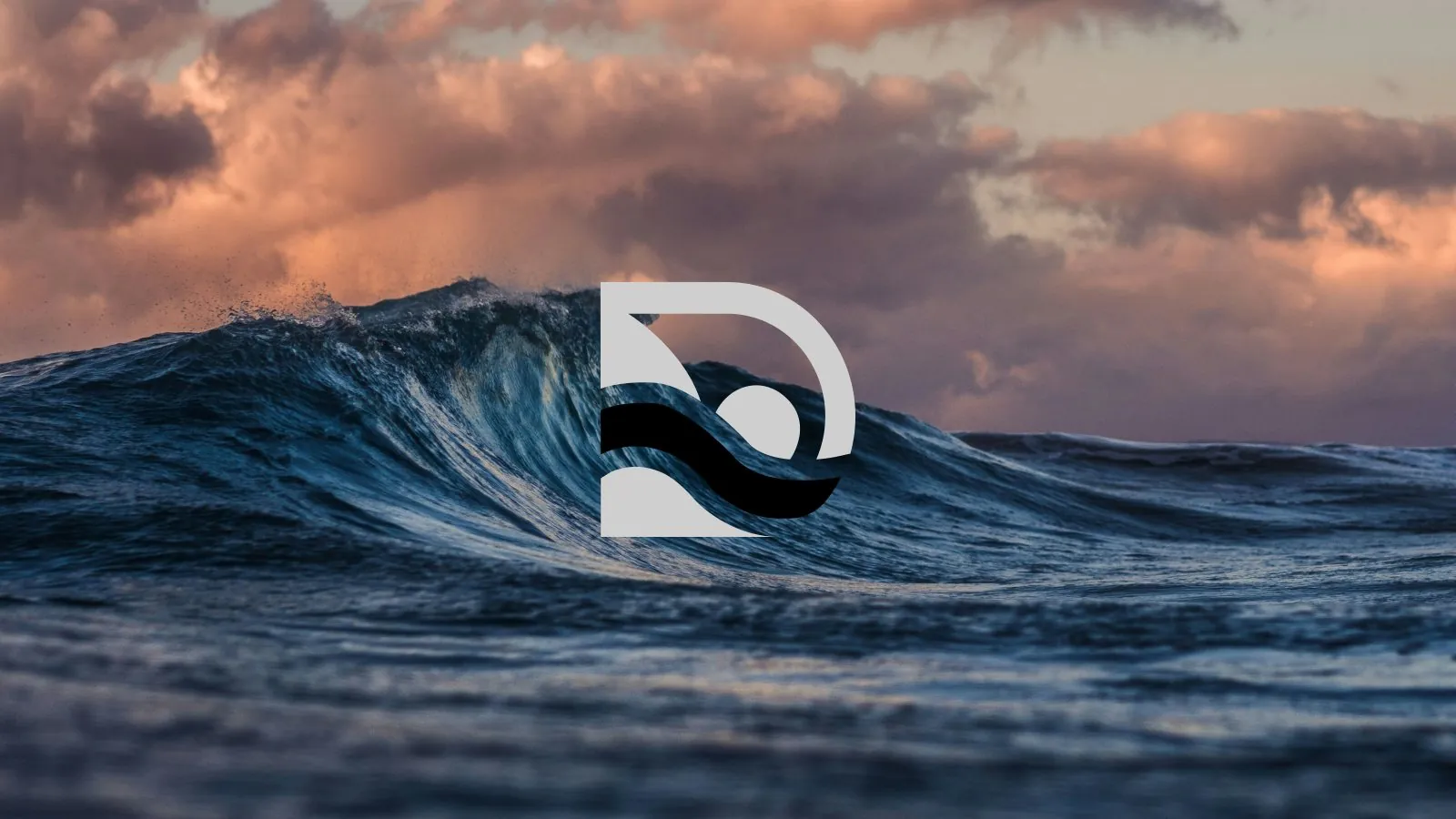
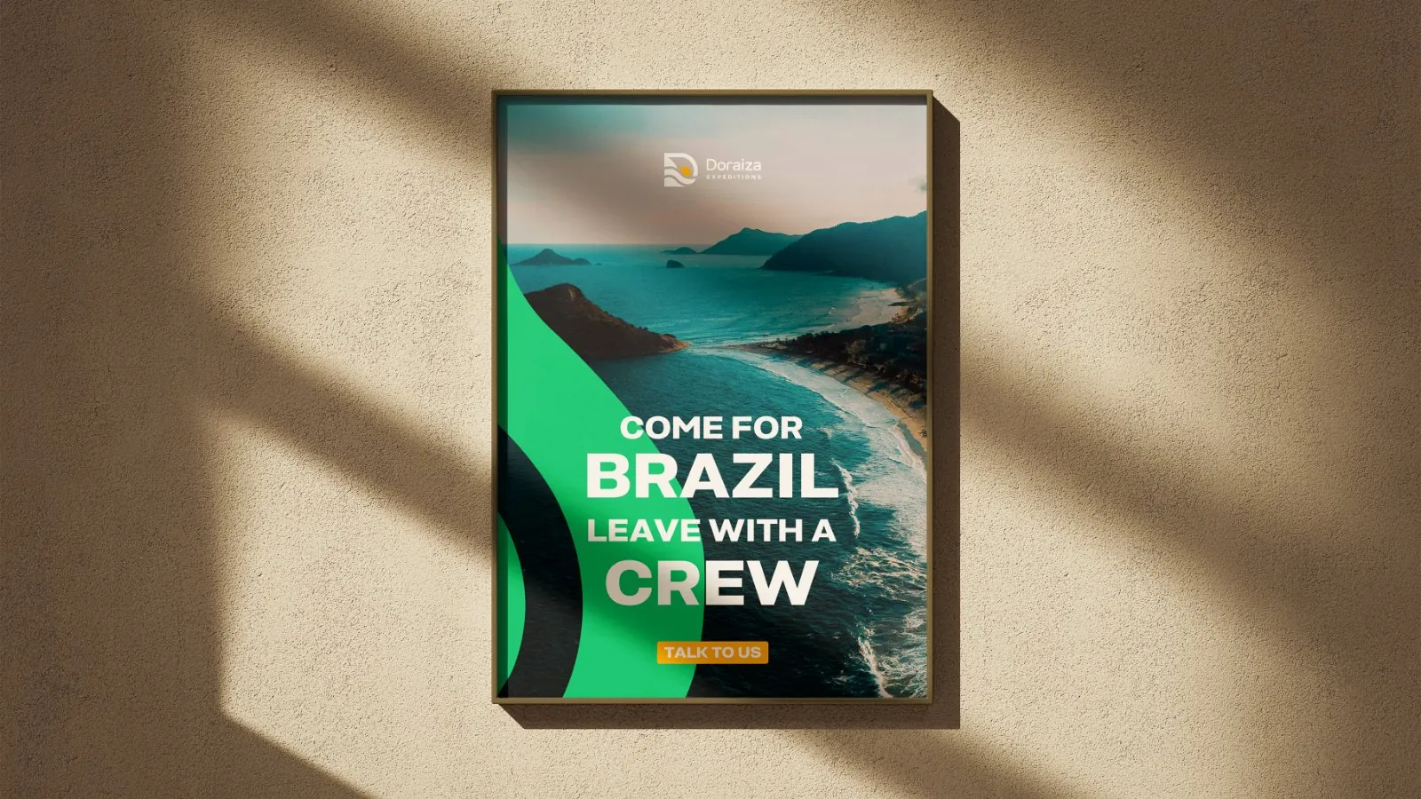
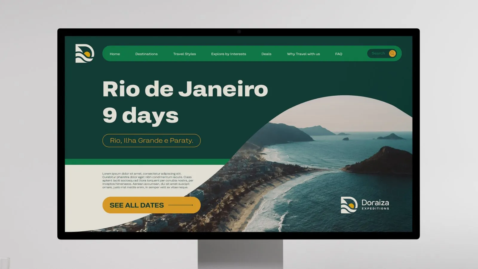
The client is travel creator Izadora Moraes, who has around 180,000 followers on her verified Instagram profile. Doraiza Expeditions is her international brand. My work covered the identity from the brief to the final files.
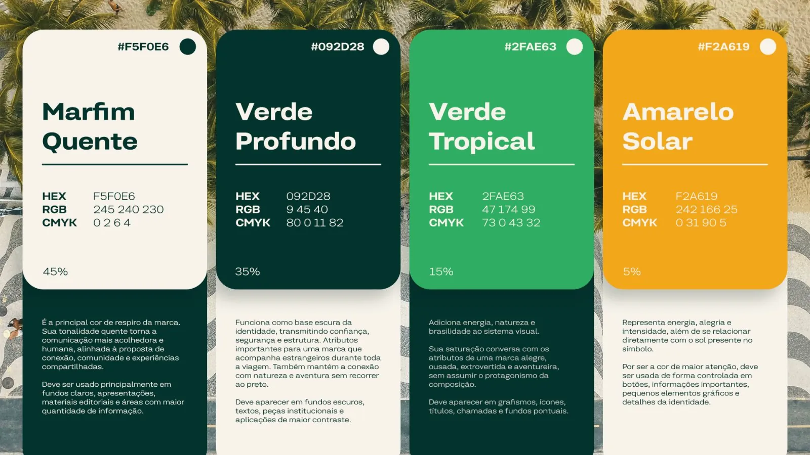
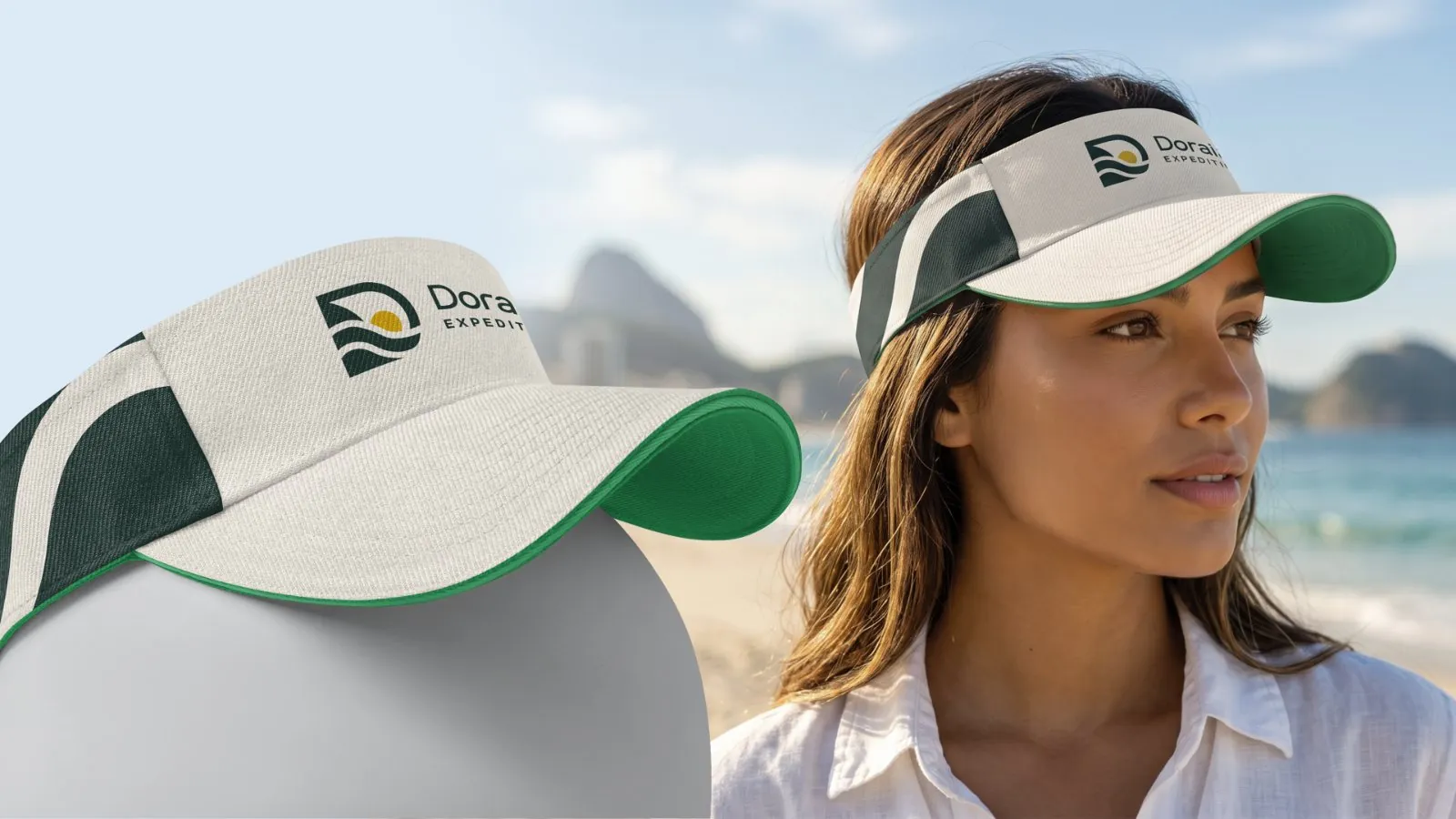
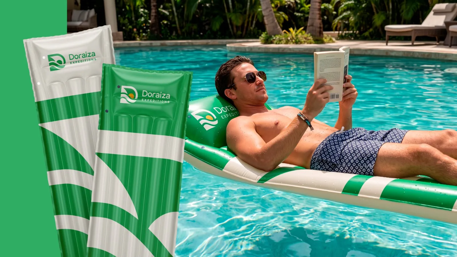
For the name, I used Kommon Grotesk Extended with spaced letters in EXPEDITIONS. The palette pairs deep greens with warm ivory and yellow.
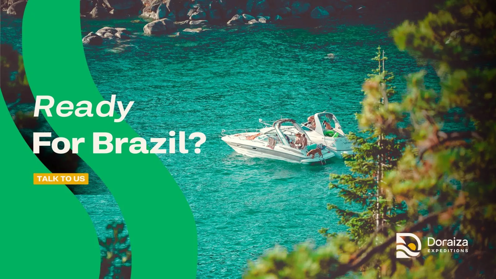
Symbol, wordmark and campaign, applied to a billboard, social posts, the website and app, and travel items such as caps, bottles, notebooks and tour guide lanyards.
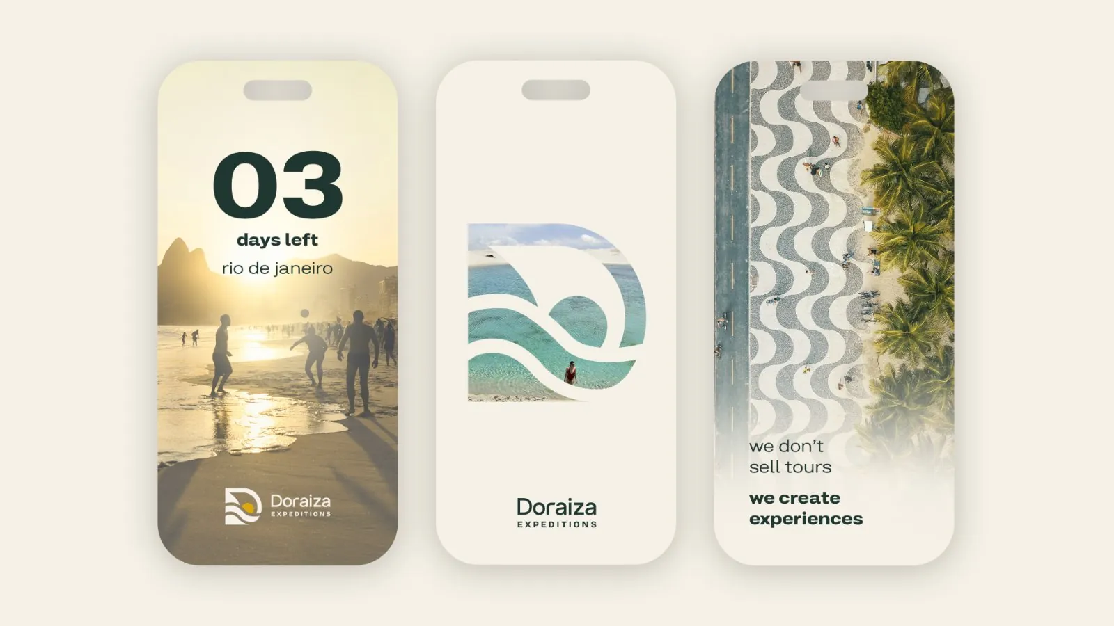
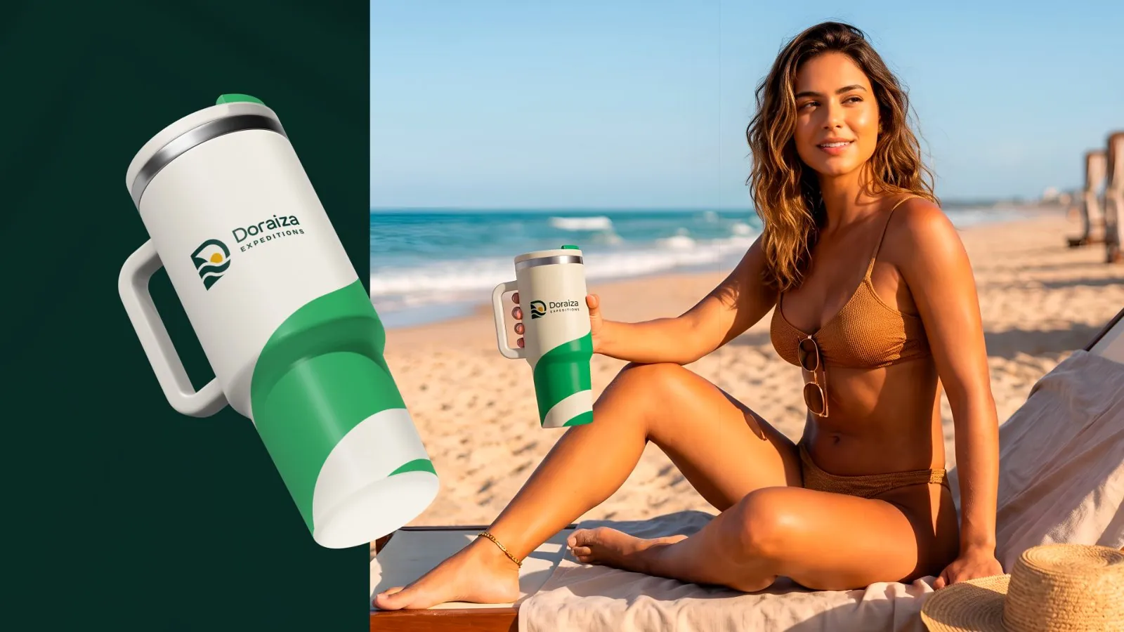
Scope: visual identity, from brief to final files · Manto Studio
I adjusted the wordmark’s proportions and spacing by hand, then used the same shapes to draw the symbol. Terracotta and other earthy colors fit the school’s idea of a welcoming place to learn electronic music.
Casa Groove has had more than 50 graduates.
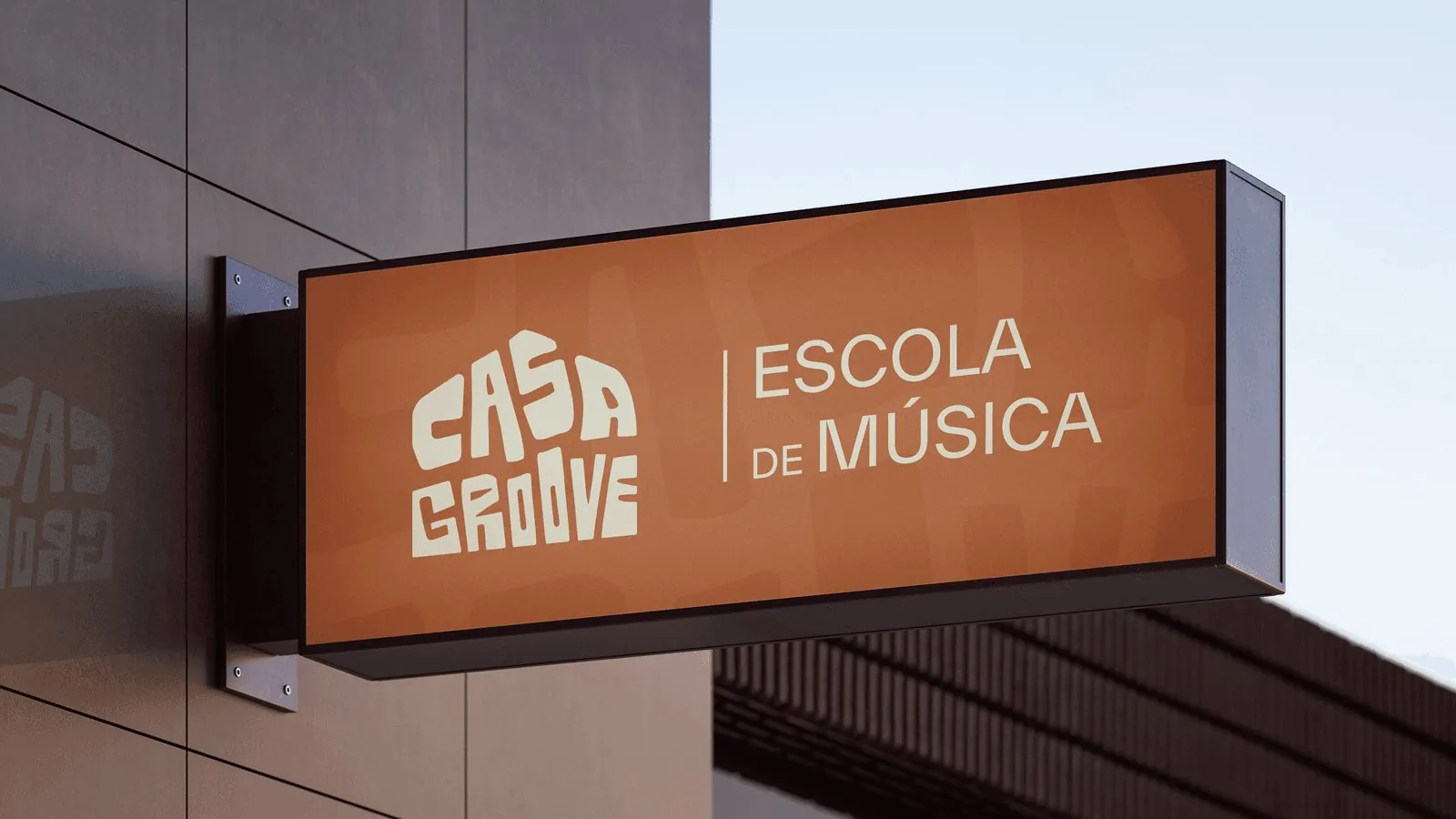
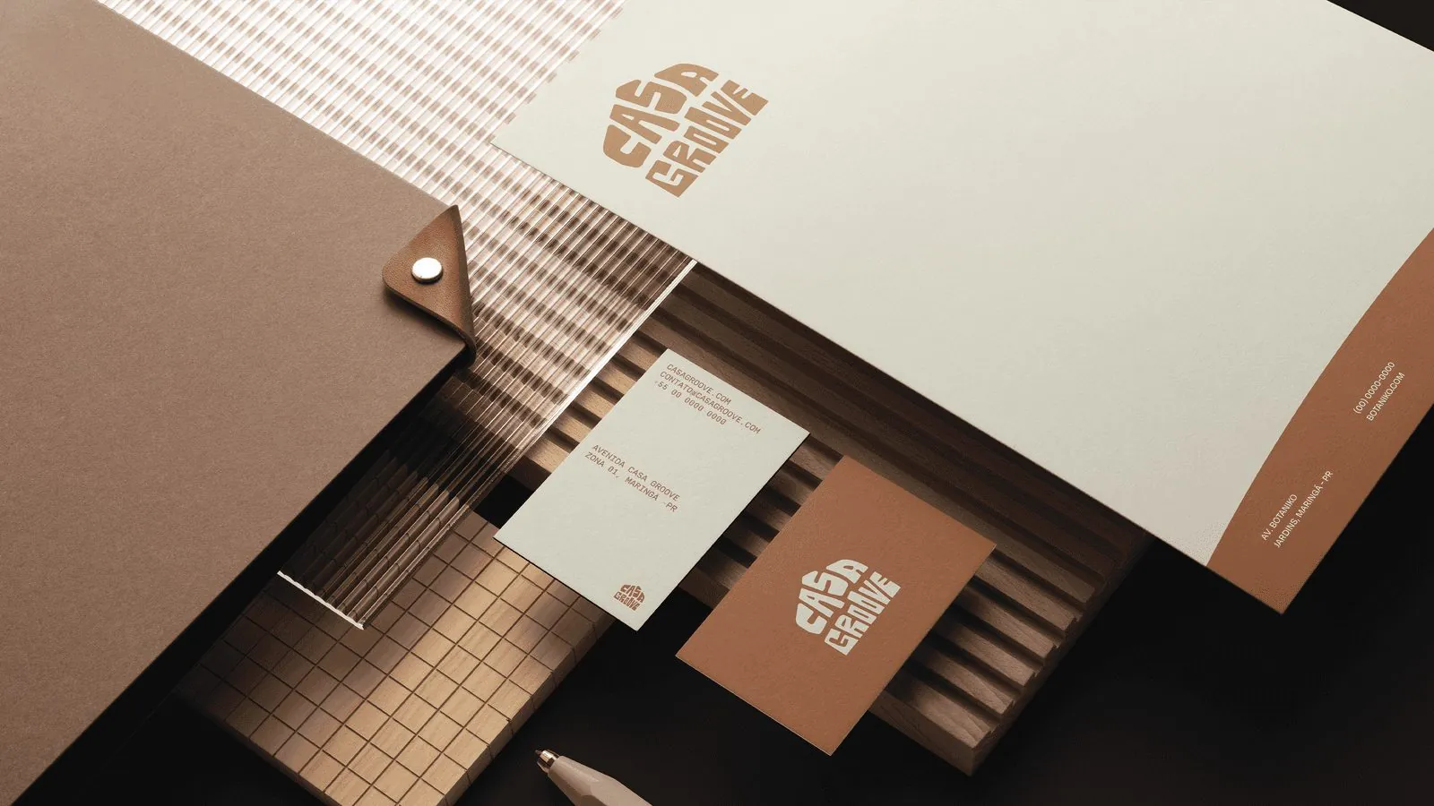
Scope: visual identity, from brief to final files · Manto Studio
The barbershop starts by understanding how each client wants to look. I kept the language conversational to reflect that approach. In the layouts, I left space around the heavy lettering so it wouldn’t feel crowded.
Scope: visual identity, from brief to final files · Manto Studio
The repeated vertical shapes and consistent proportions give the lettering a formal appearance. I used deep blue and gold on the stationery. The symbol doubles as a seal.
Scope: visual identity, from brief to final files · Manto Studio
The curves refer to sound waves, connecting the mark to his music. The gallery shows the identity on promotional materials and merchandise.
Scope: visual identity, from brief to final files · Manto Studio
Felipe combines sports science with practical advice. I used geometric sans-serif type and a neutral palette for his materials. You can see the treatment on the business card and phone screen below.
Scope: visual identity, from brief to final files · Manto Studio
The star stands out first; the tooth appears on a closer look. It’s a reference to the change in a patient’s smile. Rounded contours soften the drawing.
Scope: visual identity, from brief to final files · Manto Studio
“Feito com cuidado, servido com amor” means “Made with care, served with love.” The line refers to how the food is prepared and served.